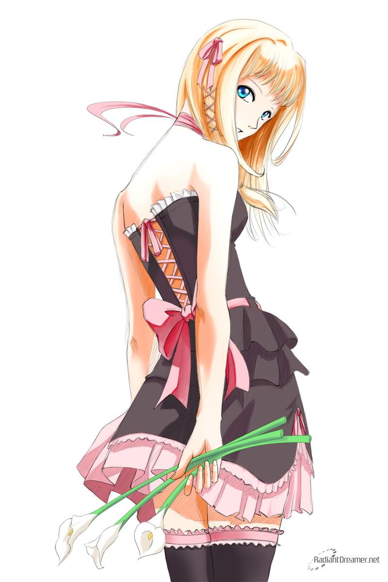
My latest work. I’m most happy with this one. Have you ever wondered how they paint images in eroge or box art? I might be able to provide you with some insight. For the first time, I’ve documented my progress in video format and uploaded it to youtube. More after the jump!
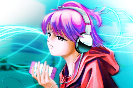
After my paint of Melody, I would have to say that I was not happy with the result. It looked okay, I guess, but it lacked the sharpness and clarity of today’s modern anime. As my wife had put it, my skills were “old-school”.
I mean, check it out, this is Melody that I painted last time:
This is something that I did in 1993 in color pencil:

You might have noticed that they kinda look the same. There are some improvements in technique, sure, but generally it’s not a whole lot. So I decided I need to update my paint style. I noticed some key differences and made sure to pay attention to those differences when I started my new painting.
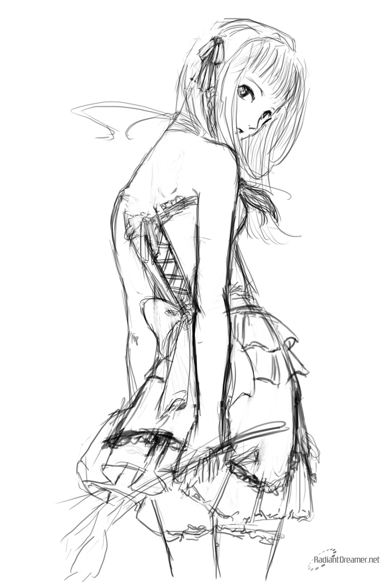
So here’s the sketch that I did. Since I wanted to paint something different, I decided to draw something a little different to go with it:
Right from the getgo, you’ll notice that I am trying to put more attention to detail in just the sketch itself. Though the sketch is still rough, you can already see the final results forming. My sketches are generally really rough, so this one is a bit of an improvement. Being rough has its advantages of looser definition and freedom, but that’s a double edged sword, as then there’s ambiguity. Trying to define shapes properly in the final line-art tends to make the line-art more stiff. In other words, being more restrictive in the rough will actually help improve the final line art.
There are two things I picked up from my observations of the more modern-day anime style. Firstly is line weight and quality. It seems that thick lines are out. Thin lines produce a much sharper image. It doesn’t fight with the colors to define shapes.
Secondly is shading. My previous method involved lots of gradiants transitioning from dark to light. This was great in defining depth and roundness, but it also made the anime subject look rather unnatural. These days, hard edges are used. Though more modern anime tends to do away with that, and use Superflat coloring.
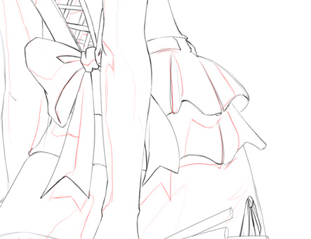
I found that creating a shadow guide is helpful in painting in the shadows. Drawing those shadows in during the paint process is inaccurate, and leads to undefined results. You’ll notice that a lot more time has been spent in the pre-paint aspects now.
I didn’t think to record me painting this image until after the drawing was completed, so alas, you’ll have to wait until next time for me to record a drawing. So from here, instead of still images, I’ve created a video recording time lapse of the painting process. The painting took roughly 6 hours to do, and this has been compressed into a more digestable chunk. I’m sure you won’t have the patience to sit through 6 hours of me painting.
Enjoy!
Since I was at it, I decided to create a black dress version too.
Which one do you prefer?


Hmmm… I like the black dress version for some reason. Perhaps it’s the contrast with her skin. Gonna bookmark this post for future purposes 🙂
nice one ^o^ thanks for sharing ^^!
I use a similar process but normally what I do is with the lasso tool select the area then use alt+backspace to fully paint that area. It takes a bit more time but I think its the fastest for someone that only uses a mouse. I always have problems creating the highlight and shadow areas 😛
@Belela-san: I used to do that method. I still do sometimes. It works well for non-organic stuff, but it otherwise leaves too clean a hard edge, even under the line art. Painting it with a wacom is definitely the way to go.
You might want to try using curves. Coupled with the shortcuts, you can shape ANYTHING, and really fast too! (I used it on the calla lilies)
Very cool image and awesome videos, I love watching how artists work (maybe I could learn some techniques on the way ^_^) and a little bit of their thought process when working. Comparing to the older images, the shading really does seem crisper and more suited for animation with the shadow guides, but it does lose the softness of the image. Though with softer anime imagery the outlines wouldn’t be as pronounced, so having a hard shadow outline and hard outlines works really really well for this image and not with your image of Melody.
As for the image itself, I don’t know if I would’ve shown the back shoulder. I might be wrong, but I just see it as a little off. Otherwise I love it, mostly because I love when artists spend time on details. I also really like the line shading added in some of the shadowed parts rather than just using color, it gives it just that much more punch by adding some texture to it.
I have to say I cannot choose between the white version or black version. Just because they both allude different emotions just by the color change. The white alludes purity and innocence while the black alludes a more playful side, so why not just have them both, eh?
Referring to some of the comments on how to color, I personally just blot in the colors and shade without worrying too much about the linework, but use the layer mask to remove the excess color outside the lines instead of erasing it permenantly. It’s more of a just in case thing really.
Last point, (yea I write too much…) awesome music.
First thing’s first, Thanks for the reply. I actually really appreciate well thought out comments like yours. It has substance and is meaningful. And it gives me something to reply to!
I enjoyed making the painting video to share with people my techniques. It’s a lot of work, but it seems to have paid off. I really like this new style that I’m exploring. The art seems a lot more bolder and fresher. I worry that a hard outline with hard shadows may be overpowering. These lines are definitely a lot thinner than my usual work.
I think it really depends on the piece whether to use softer or harsher lines, and what sort of mood you want to portray.
I do agree with you that there’s something a little funny going on with the shoulder, but I’ve never drawn a back view before, so it’s a welcome change, even if it wasn’t fully accurate. ^_^
The extra sketchy lines were added later on top of the regular line. I tried using the original sketch lines with transparency, but it just didn’t work. It was too loose. Adding the “fake sketch lines” naturalized the overall image, I think.
I was thinking about printing one or the other and framing it on my wall, so that’s why I had trouble picking which one I liked more. I think perhaps for my house decor, the white one would be more suitable, though yeah, the black one is a lot more playful and mysterious.
I’m really interested in your technique. You want to set up a tutorial? Since it looks like you don’t have a blog, I don’t mind posting it here or on Mirror’s Edge for you. ^_^
Thanks about the music. The first video is from Genki Rockets (Lumines II), the second video featured DJ Max Portable 1, and Clazziquai. The third video was Lumines 1.
Hey that’s an awesome video!!! I think I prefer the white dress! It definitely takes a lot of planning to do this! Good job!
Really nice job! Looks more professional and clean than the other work you contrasted it with.
I like the white dress much more myself – I think it suits the character’s suggested personality and demeanor.
I also don’t think pink and black go very well together.
look really nice.
Cute design! I prefer the white/pink version to the black/pink one.
It’s always interesting to get a “behind the scenes” glimpse into another artist’s work. I draw a lot of anime stuff, though mine is cel-shaded and features very thick lines.
Your art style is very interesting. It’s sorta got that north american hybrid anime feel, but actually done good. I like your line quality. It works really well with your colors.
I really really like the black dress…it makes everything pop…but omg wounderful job. Im so excited, ni get my tablet like today or tomorrow.
Sweet! Let me know when you get some art up! I’d like to see!
THIS IS SOOOO awesome! XD haha
I liked the dark version… it’s more appealing. >.< it inspired me all of a sudden! thank you thank you for putting this up! ^^ I want more!!! lolz
This is gorgeous! And I think I like the white dress version best ^^
hey.. i’ve seen an art work just now with the same pose.. so which is the original? here’s the link http://sekach.deviantart.com/art/Anime-116841980
Neither.
The original pose is done by the artist Kozaki Yuske artist of “No More Heroes”. Except that mine is more original than what Sekach posted.
By the looks of it, Sekach literally traced, where as me, I only used it as reference, repositioned the shoulder joint, and put her in a full outfit.
And as you can see from the videos, I also put in more effort.
oh… i’m not familiar of “no more heroes” i see so sekach’s work is traced? and yea, i see your effort! ^^ nice job! 😀
Hi there!
I like the loligoth in white the most! She’s so pretty, a calm kind of beauty.
And the colors are astounding, mainly the skin’s shadow.
You’ve done an awesome job! Keep it up!
Debbie
Thanks for checking out my blog! Yeah, I like the white one too! ^_^
I prefer the white one, and damn, that’s awesome!
Thanks! Always good to see you on my blog! ^_^
hi there, i saw your lolita speedpaint and i’m very impressed, i do hope you can have a basic tutorials on how you do your art like maybe the brush you when you outline and color. just a request hehe… i just recently bought a wacom and i don’t know where to start hehe… take care!
Hi! Thanks for checking out my blog! I’ve got a few other tutorials on my blog, so check out the “Tutorials” category!
I like the black one best! ^^
i actually watched your video on repeat when i was doing my drawing. even though i started similarly, i end up having an annoying tendency to blend it so much that it turned out crappy though.
Use thicker brushes with less opacity, and don’t get into the habit of Alt-ing too too much. You’ll end up with better highlights and shadows. Good luck!
Your video is really inspiring! great lineart and really shows how much difference it makes to pay attention to detail. Loved your pic so much I was inspired to draw a back view as well but mine still looks doll-like, doesn’t seem to have that lifelike energy that yours does perhaps you can offer me some advice?
Thanks Christopher!
I checked out your blog and saw the art you were talking about. There are definitely some things you can do to make your image less “doll-like”. Check out my older post on mirror’s edge – http://mirrorsedge.wordpress.com/2008/03/15/elf-girl-dancing for a tutorial on dynamic lines.
gr8888888888888888 job 😀 😀 i mean amazingggggg 😀 😀 for me i luvvvvv the white dress … don’t y .. but i guess bright colors suits blond ppl the best 😀 😀
Thanks! Ichigo-chan! 🙂
I’m partial to liking the white dress too because she’s blonde, but the black dress really does add a bit of contrast and mystery to her too! I can’t really decide after all! 😀