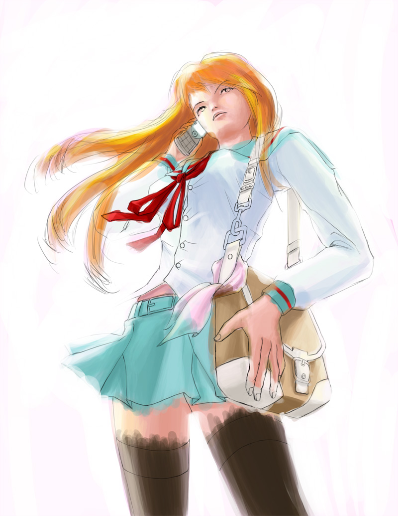
This isn’t the first time I’ve ever done fan-art. Everytime I do though, I try to represent the character in a different light, to show some variety and for people to think “what if…”. It certainly brings a bit of flavor to the picture. I decided to draw Mikuru Asahina. Mikuru is always getting abused and molested by Haruhi. She’s also completely, and ridiculously moe. So much so that I got sick and tired of it. What better way to try a fan art of Mikuru but with a completely opposite attitude for her?
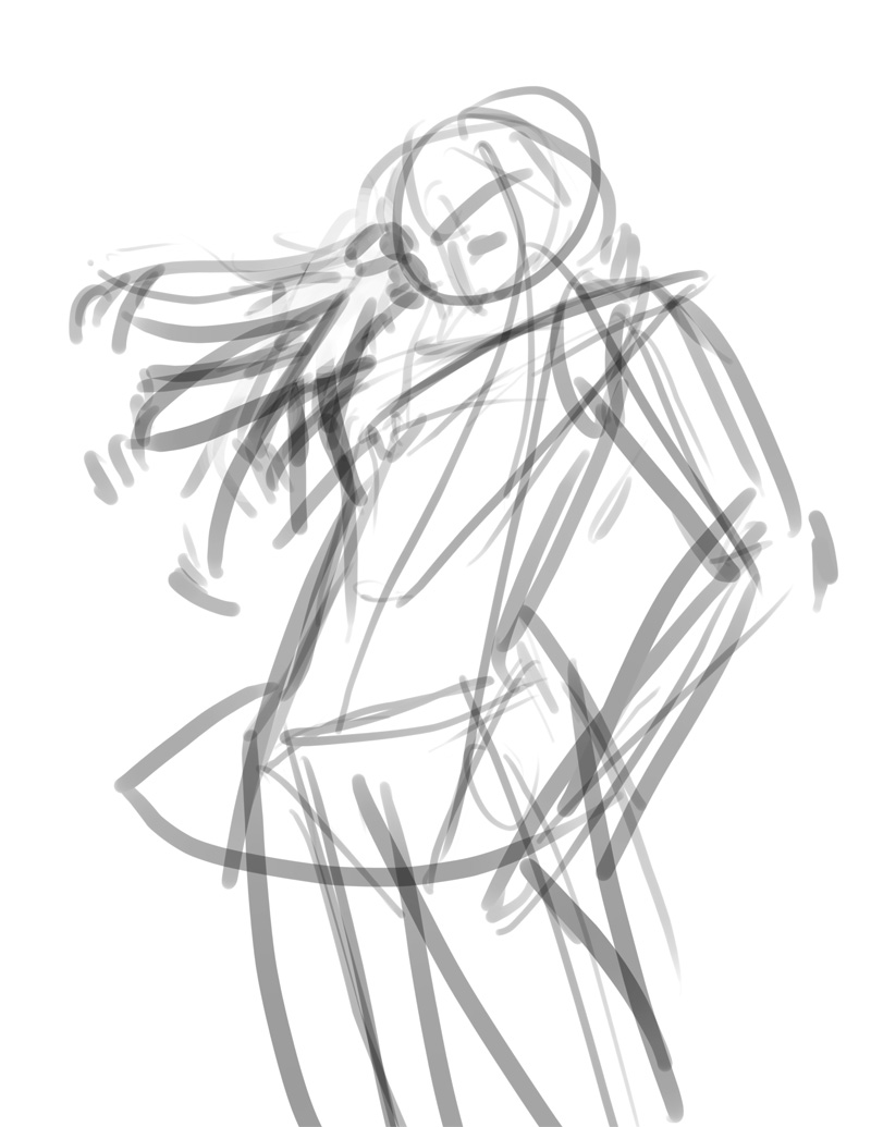
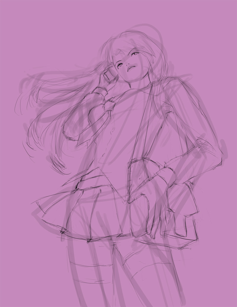
As always, I start with a gesture drawing to get the general composition and flow going correctly. I think you should be able to spot the dynamic lines in this. It also helps me determine quickly proportion problems, and becomes very easy to cut things and move things around at this stage. If you can’t tell, I’m using a lower camera angle than I usually use. The last time I did this was Apprentice Mage.
Next up is the rough sketching. I lightend the gesture drawing so that I could see what I was doing.
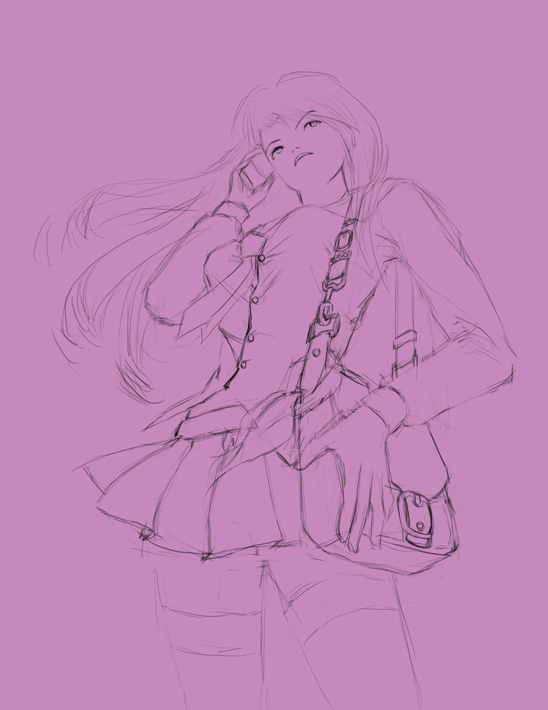
Here, I added detailing, mostly to her handbag and shirt. There’s a reason why I decided to put so much detail into these, actually. I’ve always liked details in things like buckles and bags.
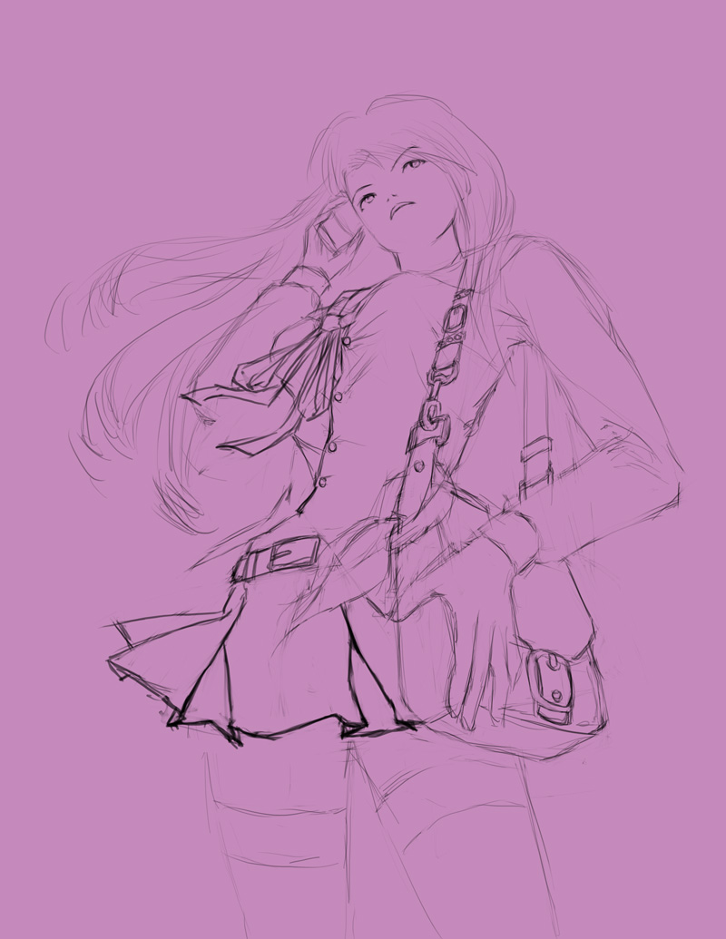
Upon further inspection of Mikuru’s school uniform, I realized that I had made a grave mistake. I should have pulled up some reference. Drawing from memory can sometimes be a failing thing, and I’m getting too old. Making the corrections wasn’t too hard, since I was still in the rough line-art stage.
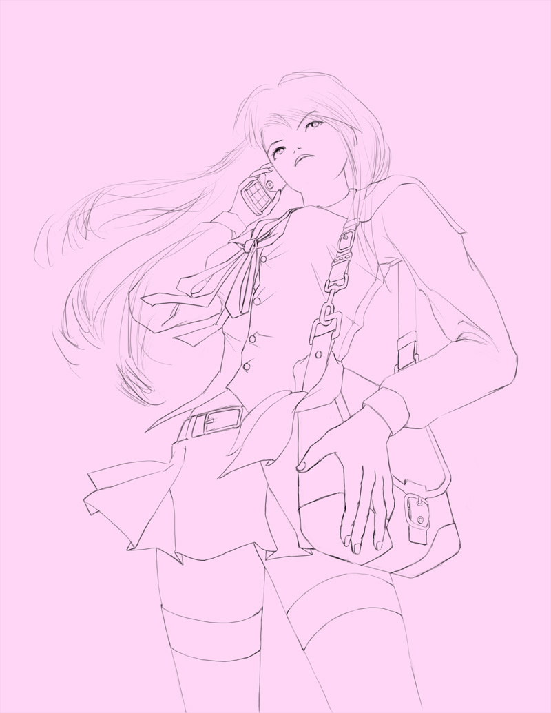
The cleanup process was actually quite time consuming this time around. A lot of the lines had to be tweaked, and I also moved Mikuru’s arm lower so that it would look more proportionate. I mean, she was putting her phone above her ear in the rough line-art. The reason I chose a pink as the background image is so that I can use it as a base ambient color when I paint over it. You may notice a tad hint of pink in the final illustration.
An incredibly messy first rough-in of the color. I wanted to bathe the illustration in white light, so a lot of the colors had to be more washed out pastel-like but with high contrast.
The cleaned-up color. I used a pattern for the bag and for the scarf, and tweaked it to my liking. I color corrected the skin, and the rest of the uniform so that it would feel more together, and I added in crease detail into the clothing as well. You’ll probably notice that the skirt seems kind of short compared to the anime version. Intentional. You’ll also notice that it rides at the hips rather than the waist. Intentional. You’ll notice that the black socks go very high, while the anime version isn’t even knee-high. Intentional. Hey, this is fan-art, but I’m the artist. I can take liberties if I want. After all, she is carrying a different attitude, as well as a designer brand-name bag to boot.
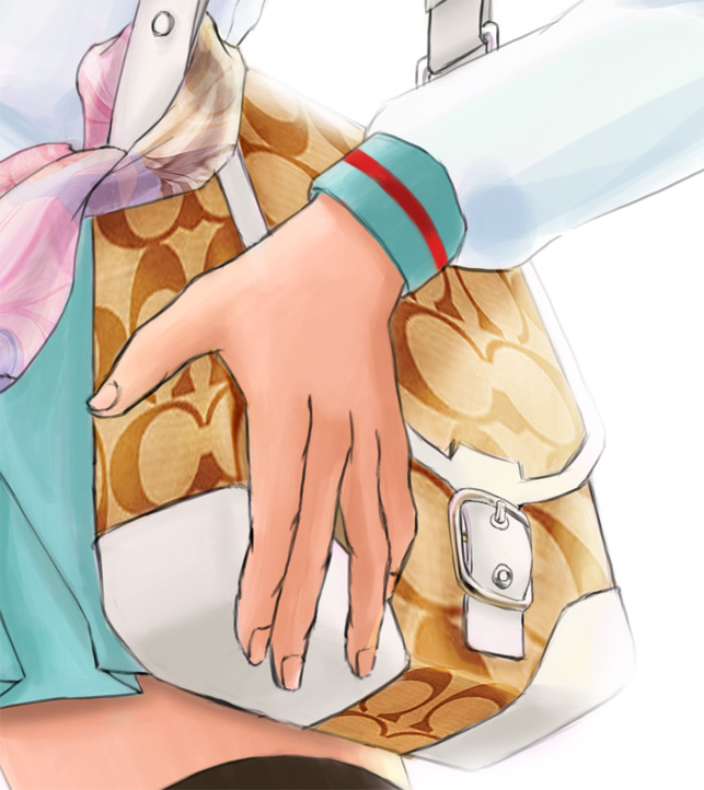
Let’s take a closer look at a few things:
The bag is a Coach bag, actually a hybrid design that I came up with based on these two bags:

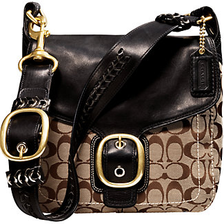
The reason I decided to choose a coach bag was because it’s just more interesting when you have something a little more than just a plain bag. Alternate Mikuru’s personality is a lot stronger, so giving her a designer bag set more of a statement.
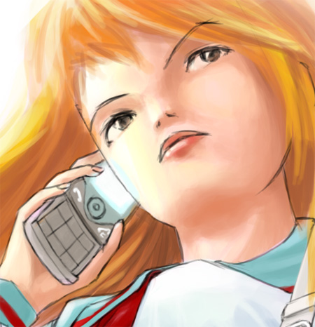
Detail in the face. I’m actually surprised how well the line-art for the face turned out. It’s simplistic, yet at the same time, seems very high-end fashion. She has a look of confidence, and can show you who’s boss. The cellphone she is using is a Samsung u708. My own phone. Very sleek, light, and very shiny! The phone design also appeals to the female demographic, as the video seems to advertise. So a very suitable phone for Mikuru in my opinion.
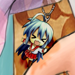
And we must not forget the adorable little Kotana keychain dangling off the bag! Something I forgot to include within the drawing diary. Suprise! Why Konata? Simply because it’s known in the anime otaku realm with the sharing parodies between Haruhi and Lucky Star.
Hope you enjoyed my new work, keep checking back for more! And as always, there’s always my gallery at https://www.radiantdreamer.net to tide you over until next time!



she looks too human ._. but the konata keychain is good :p
I like the coloring, and the patterns are very nicely done.
ha ha yeah she does look more human than anime. I was intentionally trying to go away from the moe style. Actually, I’ve been trying to experiment with a less anime style anyway (like how Shunya has a less anime-style nose for his drawings).
You know, for some, that low angle isn’t low enough. ^^
^^ It’s not low enough for you? Nah, if the skirt blew a little higher, then it would be okay. But that’s not the point! 😛
yeah the angle need to be lower or the skirt blew higher, hmm i still prefer the moe version of her though ^^
you guys are pervs! ^^
the angle no need too low.. too low not nice.. just make the skirt blow up higher enough..
hahaha
Whoa, how did you shade like that? You should one day put up a tutorial on shading & what brushes to use.^^;
Love your works.
Added to my bookmark list 🙂