Neogaf is having a contest. Well, actually it’s more like Arc System Works Europe is holding a contest hosted by Neogaf. So I’ve decided to participate with heated soul! Part 2 of my work, continuing from Part 1.
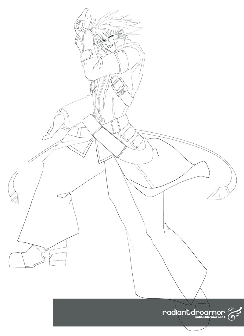
From the get-go I decided that I wanted to draw my own cover as opposed to simply compositing official art into another cover. The problem was that it would be a harder sell, and may not be marketable. Well it’s pretty obvious that the official art is marketable, so I aimed to mimic it as close as I could. To start, I sketched out a layout of what I wanted the cover to look like. But instead of revealing the entire cover right now, here’s the sketch of Ragna I made:
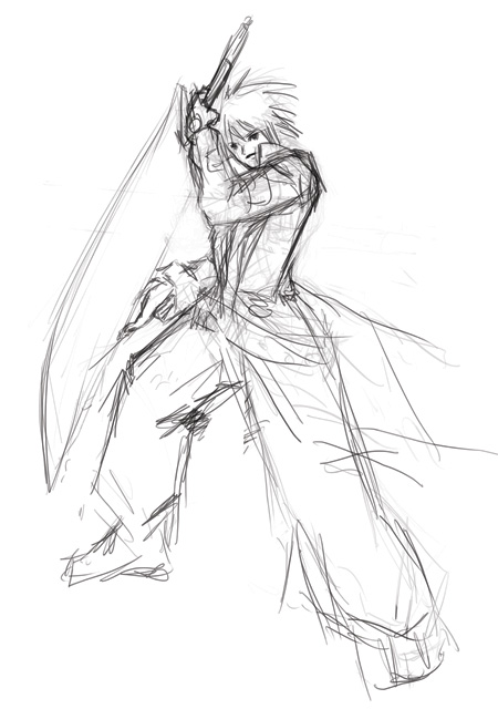
This is actually already the 3rd iteration sketch. I can’t remember how many hours I spent cleaning this up. It looked like utter crap, and this was already the more “refined” version of the sketch. The resulting cleaned up line art:
I used this as my reference (and of course, a few other shots from the artbook and whatnot).
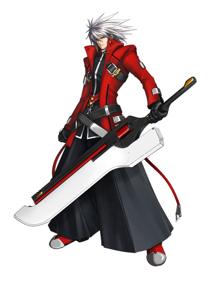
I basically had it side by side, and used the color picker to pick highlights, midtones, and shadows, and tried to mimic the shading style as best as I could.
Like the Noel fanart, I started off at a lower resolution. It’s basically 600dpi (I sketched it in 300dpi, and then scaled it up 200%), but I think I should have gone with 1200dpi to get finer and cleaner lines. Well, lesson learned. I’ll probably keep using 600dpi for the rest of the cover, otherwise it would look unusual that everyone is crisper looking than Ragna and Noel.
I took the time to record a time lapse video of the entire thing. It’s playing a little fast, I know. I had originally set it to record one frame every second, but that resulted in a video too long, so I changed the framerate to 60fps. This essentially means that every 1 minute of footage equals to 1 hour of actual work. So 7 and a half hours for this one. Slightly longer than the time spent on Noel.
[pro-player]https://www.youtube.com/watch?v=Rgi-ekhKNjA[/pro-player]
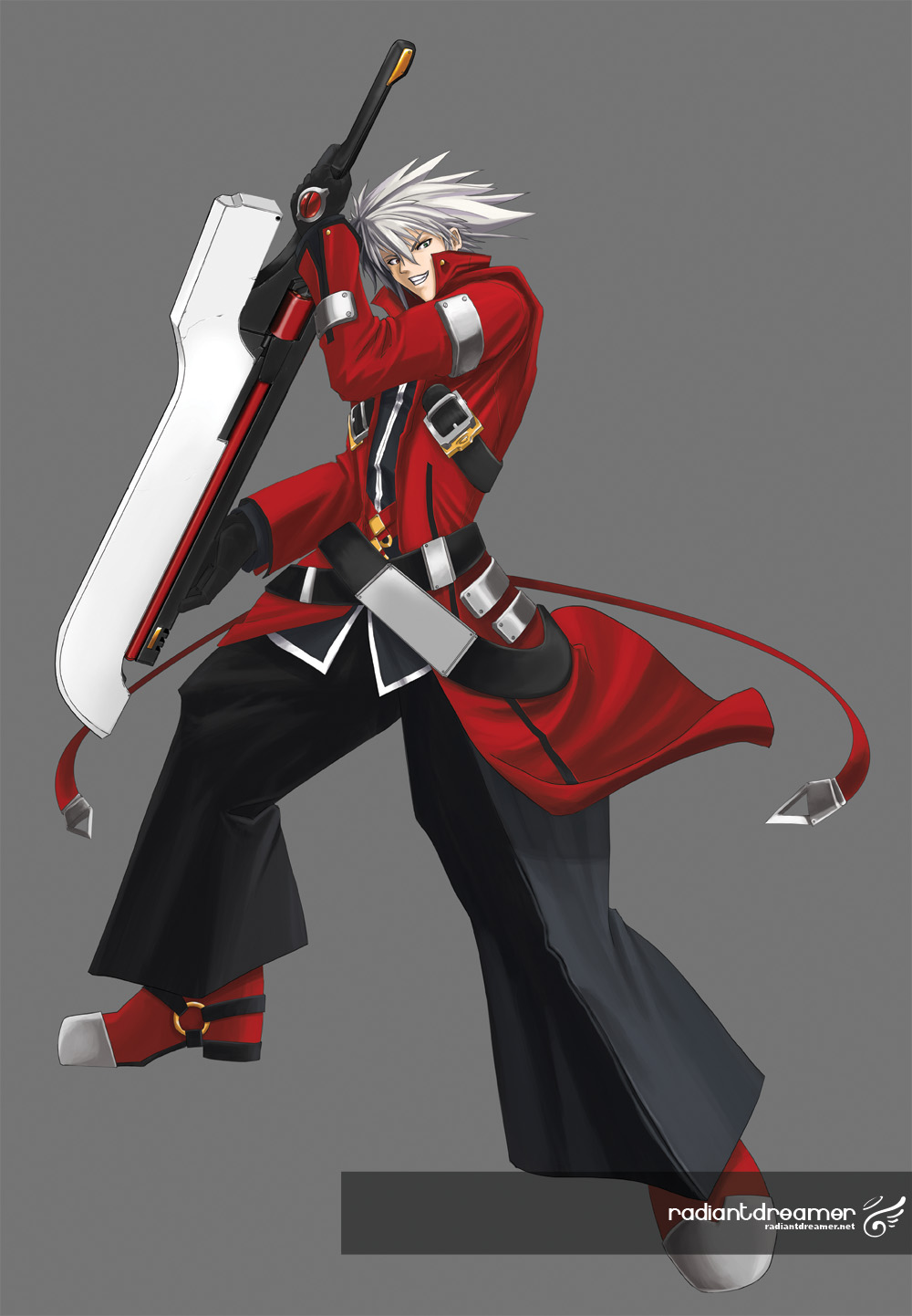
The final image result:
Overall, I’m not as happy with this one as I am with Noel. I do like the more expressive Ragna, but the leg pose is a little off to me. I’m not too concerned about that at the moment, once you see the cover, you’ll know what I mean.
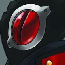
Here are some close up shots that I found particularly fun to do:
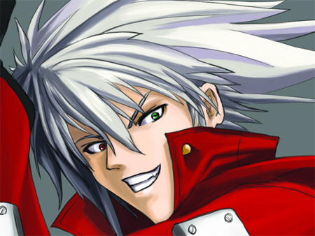
It’s definitely been a lot tougher doing this one, as recently, things have gotten a little bit hectic. I’ve still got three more to go before I comp them into a final cover. With the number of hours I’m putting into this, I REALLY hope I win this contest.



I have to say, face is scary ^^;
Yeah. Wanted to bring out the psycho in Ragna. ^_^
Nice attempt at Ragna, very cool pose of him holding is sword.
As for the legs, from the official art, Ragna is wearing something similar to a hakama I think, but your iteration he looks like he’s wearing just really baggy pants. And the feet seems to be a little flat. You did say you aren’t worried, so I’m imagining in the final comp most of his legs won’t be visible.
I do love what you did with the shading of the pants, especially the crease as it stands out. As well as the little details such as the gold buckles and the different colored eyes (I didn’t know he had them…Desu).
Otherwise, looks great, I can’t wait to check out the final composition. It’s amazing with how busy you are you can still churn out things like these. I guess it’s more of a stress reliever than anything cuz I can feel you’re having fun with these images.
Very awesome fanart. I just played Blazblue and it’s unbelievably amazing. I hope you win this contest. What are the prizes?
Thanks! I’m actually not sure what the physical prizes are, but if I win, my cover will be featured as the UK edition’s box art, which would be pretty rad.
No effin’ way! Man, that’s one way of being forever immortalized in the video game world. Well, I wish you the very best of luck!
Ah, no worries about that. I’ve been working in the video game industry for over 6 years now. 🙂
THAT IS ONE OF THE MOST AWESOME THINGS I”VE EVER SEEN !