 This tutorial assumes you know very basic photoshop skills. If you don’t know anything about Photoshop, you may have trouble following along. I will try to be as clear as possible and have images to illustrate exactly what I’m talking about where needed. This tutorial was constructed using Photoshop 7, but Photoshop CS2 and above work the same way. To see a larger image, just click on the thumbnail and a pop-up will appear. Be sure to close the pop-up before continuing.
The purpose of this tutorial is the basic construction of compositing two different subject matters together into one. For this particular example, I will be using one of my figurines and compositing her on another background.
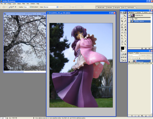 As this image shows, we have two separate images. The first is our subject, the beautiful Ms Miko Saimyoji. The image was taken in my back yard on a nice sunny day. The second image we have is a top down view of some sakura trees in full bloom.
One of the most important things about making a composited image look convincing is the lighting. If your subject is outside, you must match it with an outside background. It’s possible to take an outdoor shot to indoors, but it’s very difficult, and this tutorial will not cover that. The differences between outdoor lighting and indoor lighting is that outdoor lighting consists of higher contrasts, and much brighter speculars, especially when it comes to figurines. And then there is also the factor of a lot of ambient light, and radiosity (bouncing light from other objects) which are a lot less muted indoors. While generally cloudy days tend to mute the appearance of these factors, it’s still there, and a lot harder to tweak. For the purpose of this tutorial, be sure to find sources that have fairly similar lighting. You’ll notice that the Sakura trees are on a somewhat cloudy day, but because of the lack of real surface area for light to bounce, it’s somewhat negligable.
 Start by selecting Miko using the Magnetic Lasso tool. If you click and hold the Lasso icon, a dialog box will pop up which will allow you to select the Magnetic Lasso tool. This tool will allow you to trace over edges, and it will pick it out as best as it can. It will still be rough though. You can change the sensitivity settings as well as how frequent it drops a point sample.
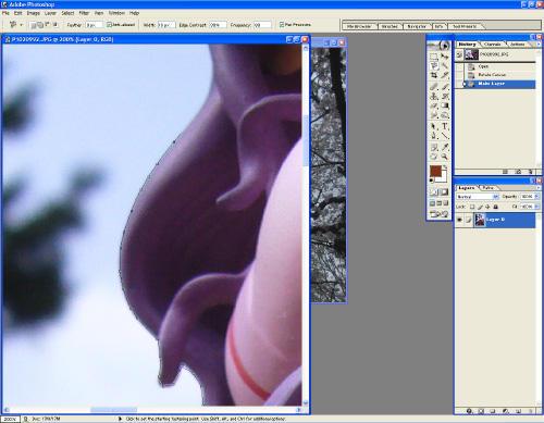 Take the lasso and begin tracing the outer edge of Miko. If you make a mistake, you can hit backspace to remove a point sample and try again. You can also force the lasso to drop a point by left clicking, if you are struggling with it. Don’t be too concerned about precision here. This is just to make a nice quick selection.
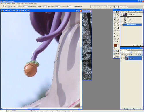 Once you are done making your selection, and have looped all the way back to your first point, (a little circle will appear on your cursor indicating that clicking on that final point will close the loop) it’s time to clean up those rough selection edges. Click and hold on the Lasso tool again, and use the Polygonal Lasso Tool. This will allow you to refine your selection by clicking points manually. While your selection is still active (the marching ants around Miko), hold the Shift key to add to your selection, and hold the Alt key to subtract from your selection.
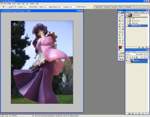 After you are done with your selection, you should have a nice clean marching ants line going around Miko. To make things easier, you can actually save this selection to a layer. On the bottom of the Layers window, click the icon that looks like a piece of paper. This will create a new layer. If you press Alt+Backspace, it will fill your selection with your current foreground color. Don’t fret! Your image is still there in tact. You just basically have a sheet above your image that you put stuff on. Click on eye to turn that layer off and save it for later.
It’s time to convert your image into a layer! The thing with Photoshop, is that each image from the start is considered a Background image. Anything you put on top of it is a separate “floating” layer that you can freely move around. The colored shape of Miko that we made just now is an example of a floating layer. The special property of a background is that it’s not transparent. If you attempt to delete a section from the background layer, all it will do is fill it with your Background color (the second colored square in your toolbar). At this point in time, we don’t want that. We want to make the background a floating layer. In the Layers window, double click on your Background. It will open a dialog box with all sorts of interesting properties. Just click “OK”. Your Background will be renamed “Layer 0”. Your image may not look different, but you now have a floating layer.
If you hit Delete right now, you’ll actually be cutting out Miko and leaving the yard. You want to invert the selection first by pressing Ctrl+Shift+I (also found under Select -> Inverse) before hitting the delete key. The result should be Miko standing on a checkerboard backdrop. The checkerboard represents transparency.
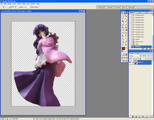 You’re now ready to drop your sakura background in. Go to the Sakura image, and Press Ctrl+A to select all. Press Ctrl+C to copy the image.
Now go back to Miko, and press Ctrl+V to paste. You will have to resize your image to fit properly. Press Ctrl+T to go into free transform mode. This will put handles around your Sakura image. The corner points will scale your image in both width and height, while the side poiunts will scale it by just width or height alone. Anywhere outside of these handles will let you rotate your image. Now you’ll find that if you drag a corner handle, the image will kind of stretch out. This is called non-uniform scaling. To prevent that from happening, hold the Shift key when scaling. This will keep your image in the correct ratio. If you want to scale it to the middle, hold the Alt key in combination with Shift.
To change the layering order of your image, under the Layers window, simply drag the Sakura layer so that it’s underneath the Miko layer.
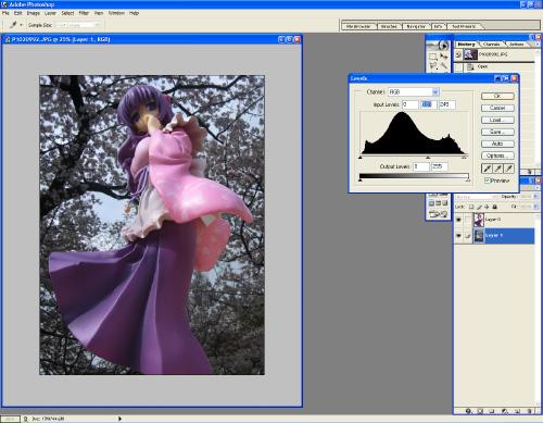 Once you have your backdrop in the place that you want, you are basically done with all the core elements. But wait! There’s more! If you’ll notice in the above picture, Miko looks really bright, and the backdrop looks really dark. At this point, it’s all about adjustment and tweaks. Depending on the mood you are going for, it’s all about artistic flare now! Start by adjusting the background to the brightness you want. Use Levels (Image -> Adjustments -> Levels). Don’t use Auto Levels. You don’t want Photoshop dictating your artistic flare! Adjust the sliders to your liking. The arrows just under the curve adjust the darks and the lights, narrowing the band and increasing the contrast. Move the right slider until it is around the first major hump on the right, and move the left slider until it’s around the first major hump on the left. Tweak until you’re happy with the brightness and contrast.
 Okay… but it’s still not quite right. It’s probably Miko herself. Repeat the same process for Miko. There are other values that you can adjust as well, such as color balance, and hue/saturation. All these are used in combination with both Miko and the Sakura trees to achieve the desired lighting matching.
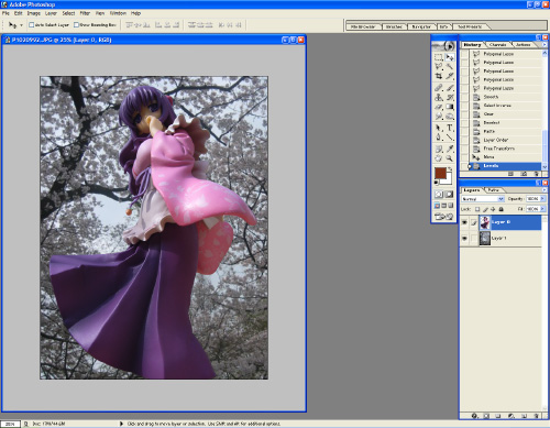 Personally, I felt that Miko needed to be more shadowed because the sunlight is from above the trees. She was too light, and “popped” a little too much from the background, making it somewhat unrealistic. So there you have it! The basics of it are done! Check back again in the near future for some advanced filtering, as well as how to do proper shadow cut-outs!


Very helpful! Thanks.
Had Photoshop CS4 while I was still in school, but that’s old news now. If I could ever get a copy of it again I’d love to try out this tutorial!
hmm I think I may write an updated tutorial sometime. This one still applies but is pretty old.