Many of you have seen this photograph, and many of you have asked “how is it done?” Here’s an in depth look at how this image was accomplished.
I had the idea even before my Elwing arrived. When I first saw Elwing online, I knew that I had to buy her. She’s just one of those figures that makes sense for me. The detail is amazing, and the pose is adorable. And she’s an elf. I love elf girls. My mascot character, Vihena was an elf. Once Elwing arrived, it still took me a couple of months before I actually got off my lazy butt to photograph her. Of course, I was waiting for a nice weather day to do this shot.
I can’t say there’s just one thing I like about Elwing. I love how the eyes are not made in the conventional method of spray-on eye decals. These ones were made of what appears to be ABS clear plastic, creating incredible depth and character. I’ve never seen that done before! I loved the detail in the wings headdress, and the bow is a nice touch. The details put into her belt and pouch are quite wonderous. It being from a relatively unknown manufacturer definitely made me have doubts, but it was worth a try. Unfortunately, I don’t have many other photos to show for all that I am saying, so this is less of a review than you should expect. Perhaps I will expand on the topic of this figure if I ever do take more photos of her.
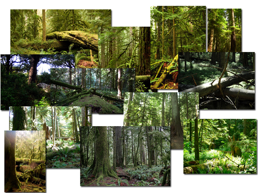
First thing I did before the shoot was try to pick a background. You’d think that a forest image would be pretty easy to find. In actuality, it’s not.
The background images that I went through.
This was just a small sample of all the background images I went through. Virtually none of them were what I was looking for. Everything was either too dark, or too light. There simply wasn’t enough atmosphere, and the angle that I wanted just wasn’t right. I needed something for Elwing to appear in, but I needed the image to be large enough in scale that Elwing didn’t appear like a tiny dot in the middle of the image. In a lot of the images, if I had dropped Elwing in, she would appear too big for the scene. Shrinking her down would ruin the scale too.
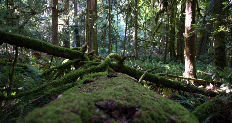
The original background image that I chose.
This image had a pretty good sense of scale that I was looking for. The log in the middle looked like a decent enough size and you couldn’t really tell how big it actually was. For all you know, it could have been just a small mossy branch. The only problem I had with this background was the fact that the lighting wasn’t what I wanted. I needed something with more drama, and much more atmospheric. This image was pretty lame to start. So off to photoshop I went.
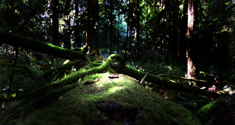
The final background image after photoshop.
I started by darkening the entire image using levels. Of course, this produced really dark shadows, and also increased the contrast for light areas, however the result still wasn’t what I needed.
I got the result I needed by using the dodge tool and painting over areas that I wanted to have brightness, to give the appearance of light shining through a canopy of trees. Those areas are typically high concentration in light, and blown out compared to the darkness and shadows of the rest of the forest in shade. I also added a few highlights around the leaves hanging around the left side, as light bounced onto it from other brighter sources.
This was also the location that I thought would work for Elwing to stand on.
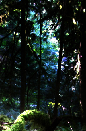 The next step after that, was to create some depth. Using a mask, I separated the main log and other foreground elements from the further background, and applied a gaussian blur to it. Lack of detail gives the appearance of depth that things are further away. I also narrowed the band in levels so that the bright sections here appear brighter, making the distance seem even further away. From the looks, it’s like a clearing into a forest path with shining sun’s rays.
By giving the image depth, the forest appears much larger than it really is.
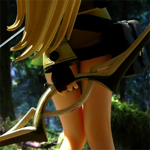
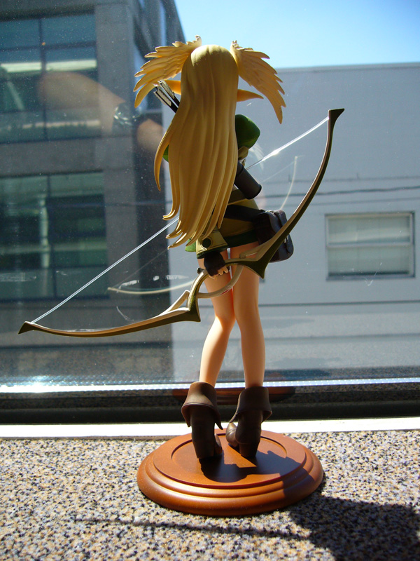
So one sunny day, I took a photo of Elwing, pretty much exactly how I wanted it to look. The key to making a convincing composite is to make sure your lighting matches. Lighting can be tweaked in photoshop, but it’s a lot easier if you’re able to get the match right from the photo. Obviously there will still be minor tweaks, such as gamma, brightness contrast, and histogram levels. However, it’s very very difficult to tweak shadows, so it’s very important to capture the proper shadows you want. For me, I knew my light source is in the upper left, and to the front, so I was able to match that in my background photo.
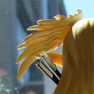 The next step was to cut Elwing out of the current background, and to drop her into the new background. There are many ways to do this, but I chose to use the polygon lasso tool for greater accuracy. Considering there were a few segments that were very detailed, it would have been difficult to get accurate cuttings using any other technique. The area that was most difficult would have to be Elwing’s headdress with the two spread wings. Going around each feather was tedious and no fun.
I tried my best to keep the nice bright rim in the image. When you have rim lighting like that, it becomes much easier to match the background with your subject, as you won’t see weird anti-aliasing line problems with bad cuts. This is particular true with two similar shaded objects. Fortunately, my background was a very different color from Elwing.
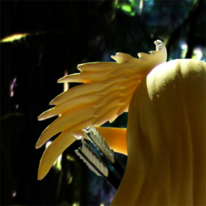
The final result.
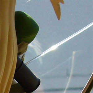 The bowstring flare was a difficult one to reproduce. The light itself fades off into the background, but of course, I don’t want that background showing! I essentially had to cut through the flare, as if ignoring that it was there. From that I had to make my own flare using various gradient shades of color, and using the transform tool to angle it right. Unfortunately the result is still not a perfect replication. Not that it would have been easy to do in the first place.
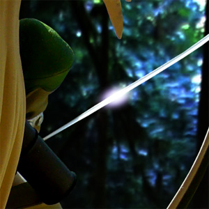 The final result.
Many others have asked about how I reproduced the convincing shadow.
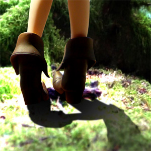 Obviously, I couldn’t use the existing shadow in the original image. The problem with that is that the shadow shows a lot of the actual background that it’s on – the figure stand, the carpet and texture. It’s simply not usable. One technique which I do not recommend using, is to create a shadow in the shape of Elwng by duplicating the Elwing layer, and fill it black, then using transform tools, to squish and skew it. This is inaccurate and almost always looks artificial and forced. What I did instead, was use the original shadow as a guide. I started a new layer, and used the lasso tool to “trace” the shadow. I then filled that with black, and then set the transparency on it so that it matches perfectly with the new background.
And there you have it. An in depth look at how I completed the Elwing photoshot. Tune in for more in the future! Hopefully it won’t be as long as this one…




this is great photoshop skills, very nice and indepth look on how the image was created
wow! this is really great!nice work done!
hoah, that’s really great, do you happen to have 1920×1200 size? or 1920×1080 ? 😀
one litle thing tho, seems like the background is not as sharp as the figurine ^^;
@ valho : Thanks! I hope to do more in the very near future. It’ll give a good idea and insights. Definitely want my blog to go in that direction.
@ shinn : be sure to check back for more! Better yet, subscribe to my feed! 🙂
@ ron : I can’t remember the actual size of the photograph, but it was pretty large. In terms of the BG itself, it was pretty small, and I scaled it up… but I put it to “distance blurring”. ha ha.
wow that is pretty awesome. I want to be able to do that but I’m an impatient person and only know a little bit about photoshop! And I kind of lack creativity so it’d be kinda hard to imagine what I want to do lol. I’d like to be able to do some of that someday though and share it on my blog.
@ Suneo : Photoshop does take some patience, but once you get the hang of it, it’s actually not as time consuming as you think. Now that I think about it, I think it took longer for me to write this blog tutorial that it did to actually make the photo! It took much longer preparing the photo – looking for sources, doing the cut-ups, planning for what I wanted to do. I look forward to seeing your work on your blog!
Wow… *breathless* that’s some very impressive skills used to make a very convincing figure blend into a very convincing forest! I love it… the lighting and all those photos to make something from the mind into reality is truly a wonderful thing to do… and makes something such as Elwing a fictional character to be on that much more real…
Ne ne Daniel, would you have the rough version of the image? I’d like a 1024 x 768 of it… with your water mark a bit smaller perhaps to the lower left corner so it’d be displayed on my desktop. ^^
Thanks Varkyle, that’s pretty nicely said. It makes me happy to do more of these images.
Mo dame desu! The image is wide-screen and isn’t meant for a 1024×768 size! You’re just gonna have to live with the one that’s here! If you’ve have photoshop or Gimp, you can resize it to your liking. ^^