When Kino was announced, I immediately knew I had to buy her. In addition, when I saw Emiya from Fate/Zero, I knew that Kino and him would make a great looking pair. Personally, I think she looks better with Emiya than Saber does. The green in Kino’s outfit actually complements Emiya’s black very well.
While waiting for the pair to arrive, I had already thought up a great scene – a desolate and drab scene showing the dark realities of our world. Once they arrived, I took several pictures of the pair at slightly different angles to get what I wanted. This was the original photo that I decided to go with:
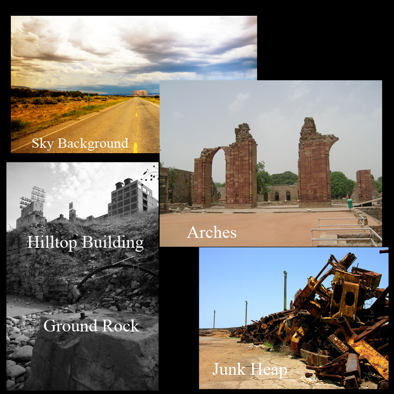
As long as the lighting conditions are proper, it doesn’t matter where the photo was originally taken. The background gets cut anyway. Though I have to admit, that this time I didn’t do as intricate of a job cutting them out of the background. With the photo chosen, it was time to find the background. Now I knew right off the bat, that it would be difficult, if not impossible to find what I was looking for in a standard photo, so it was time to put my skills to a further test, and attempt a background composite. I’m not good at it. I’ve never done one before, so I was expecting failure. These are the images that I chose to work with:
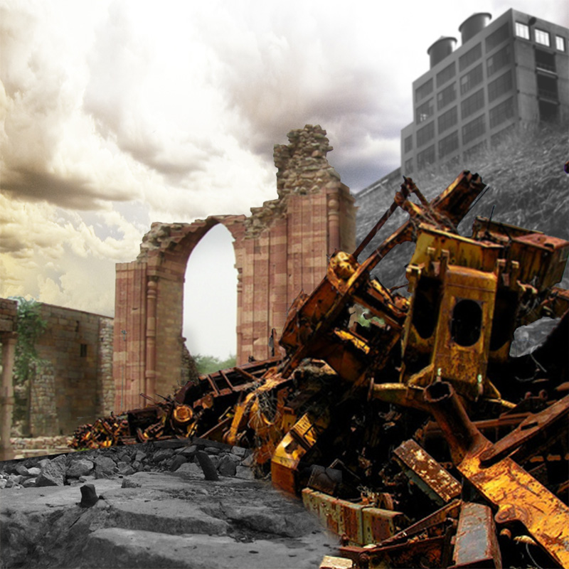
I needed to show desolateness, so the hilltop’s foreboding building was perfect. The junk appears to be machinery, possibly could be from war machines of sorts, so that was a good addition. Plus the way it “lined up” created a nice curve for perspective. The arch image was great to show more ruins, and also to frame the characters better. I needed the patch of rock from the hilltop image in order to give the ground some texture, as the ones in the other images were pretty much useless. This is what it looked like initially combined:
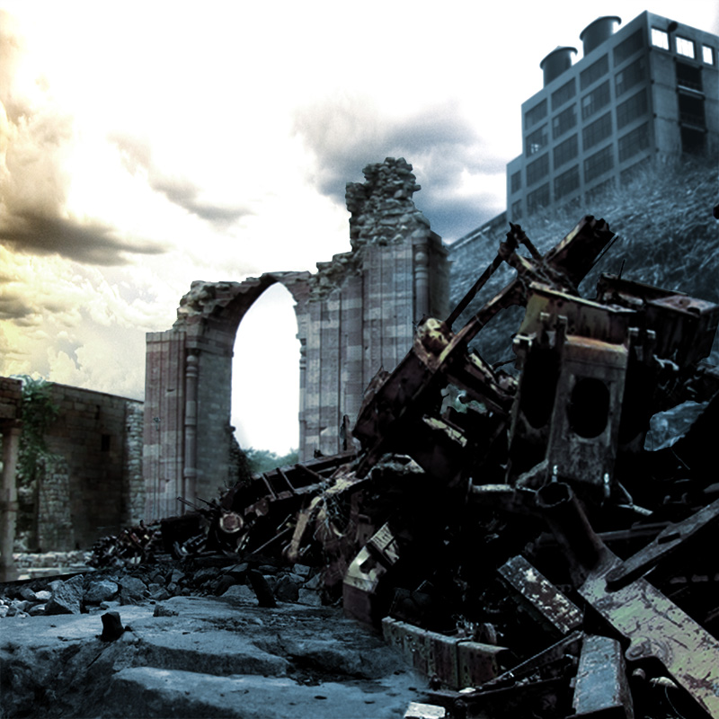
This was after quite a bit of extensive cutting. Actually, most everything is intact. It’s all masked out using layer masks. I found them particularly useful in this image, as I had to re-arrange some things a couple of times here and there, and re-do some masks. I’d be screwed if I did physically cut them out. Hmm… I may want to utilize that for masking my figures too, next time.
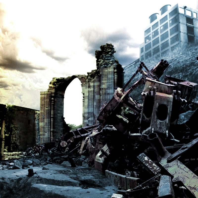
From here, I basically colorized the entire image using an adjustment layer. The reason why there is still color showing through, is because I painted on the adjustment layer’s mask to bring a bit of color back to the image. After all, a completely monochrome image is not all that appealing, and would force me to light the figures in monochrome too.
Using masks and gradient tool, I started to create more color in the scene, and used various blending modes to get the effect that I wanted. I wanted it to have a sort of Casshern look with the contrast and colors, but not completely identical of course.
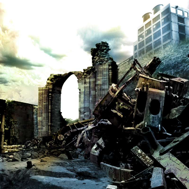
More color was added to the sharp contrasts in order to bring more life and depth to the setting. I still wanted to keep the look surreal and fantasy-like without introducing too much monochrome.
Finally, using more masks, and more layers, I created more atmospheric perspective by darkening the closer layers, and lightening the further layers. Actually now in retrospect, I think I also needed to blur certain elements more, as closer objects are more detailed, while objects further away are less detailed. Yes, I shall do that in the final image.
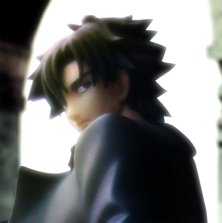
Close up shot of Emiya. I really like this angle. I like how his profile shows up. I tried to place him so that the high contrast can be seen between the white and the black. The expression on his face is perfect.
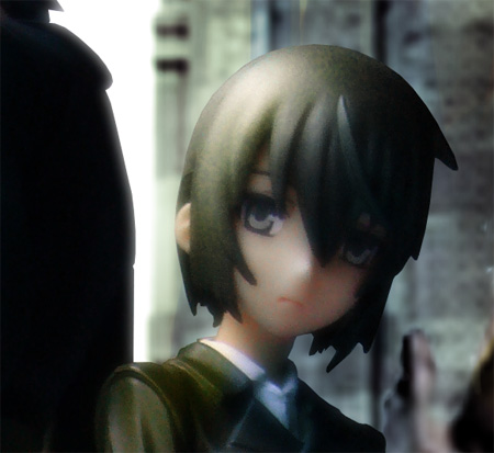
It seems like I rushed Kino a slight bit, as she still doesn’t quite look like she belongs in the environment. The lines around her look way too sharp, just as if she was… cut out and placed onto a different background! I should touch up on that again in the final image.
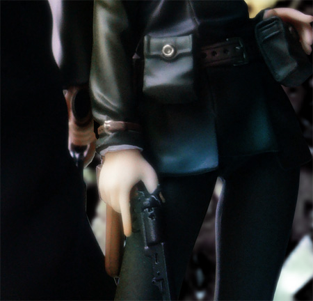
I did a slightly sloppy job between the two guns. I just didn’t cut it properly. But the point is the details on the pair are really nice. I tried quite hard to get both guns in the picture.
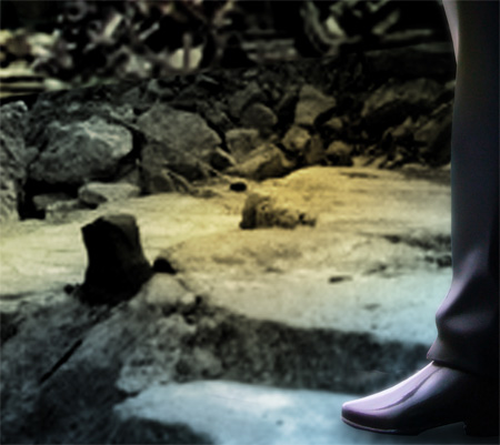
The ground section stripped from the hilltop image and re-composited onto the ground layer of the junk image. A pretty good blend, if I do say so myself. Check out that shoe shine!
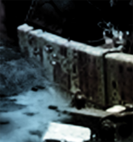
The image was unfortunately, quite blurry, but this half was also of the hilltop ground blended into the junk. I did some harsh cut on the piece of junk on the bottom so that it appears on top.
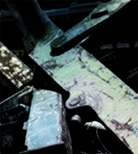
I don’t know why, but I particularly like the way the gradients on this section mixed. It gave those few pieces of metal some depth.
So there you have it! My first background composite. I’m sure that if I put in the effort and cleaned up my work a bit more, I could create a matte painting out of it, and actually animate a camera-pan, but that’s just too much.
Don’t forget to check out my gallery for more images at https://www.radiantdreamer.net!



 Read more!

superb radiant, this one really looks great, *thumbs up*
agreed. it does look really great~~~ ^.^)b
Kino and Emiya do make a great pair. I like the scene a lot.
Thanks guys. Already got ideas storming up for the next shoot. But that requires me to get off my butt and finish that Armored Core model kit. lol.
great photoshopping skill!
but I think will be better if you show some of the hilltop building hill between the arch, I just find it a bit strange, since the hill is quite high ^^; other than that, great job 😀
Oh, but if I did that, then it would cover the arch. I needed light to pass through it to contrast against Emiya’s silhouette. I am actually assuming the hilltop cuts off, so the arch is like a doorway to a canyon-like pathway.
hmm but it does look abit strange to me, maybe you need to draw a litle bit of the hill between the arch (imagine a straight line from the hill to the green grass on left side of the arch) 😀
hahaha wow.. new partnership! 😀 and I love that background!
but the third last photo, Emiya’s shoe is as if not stepping on the ground (aka floating).. 😛
btw, let’s exchange links ok? :)radiant
Looks awesome, I might give it a try later.
WOOW!
Hermoso….