Rakka from Haibane Renmei, created by Yoshitoshi Abe of Serial Experiments Lain. This figure was manufactured by Creator’s Labo, and is on my to sell list. But before I part with her and list her for sale, I wanted to do a photoshop of her. She’s very photogenic, and I was very surprised at how beautiful the raw photos turned out.
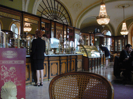
At first, I had difficulty compositing her into a background that I really wanted, mostly due to my shoddy perspective angles. In the end, I chose this as a background image:

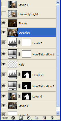
It’s some sort of cafe, which was what I was looking for. I had to change the perspective on it slightly to get it to match Rakka. I actually won’t go into the details of every step that I took, as most of it is just adjustments, so here is a peek at my layers that I have:

On the very bottom layer, I have a solid white. No real reason for it anymore. Layer3 is the background layer with a gaussian blur, layer 0 is the original photo. This time, instead of cutting the background from the image like I always do, I’ve used a layer mask instead. Using the layer mask, I created a hue/saturation and levels adjustment layers with masks applied. I then used a brush to paint out sections that I didn’t want effected. (much like what you would do with a mask when painting resin kits or gundam kits)
The Halo is a duplicate of Rakka, with everything erased except the halo, and then blurred, and put on a different layer effect.
The two adjustment layers above that are general levels and hue/saturation adjustments. Adjustment Layers are a very useful non-destructive way of editing your photo. If I felt the image was too bright or whatever, I could hide those layers and it would basically revert to pre-adjustment, or I could tone it down by adjusting the opacity of the adjustment layer. Overall very powerful.
The layer above that is a flattened version of everything below that layer, and blurred. Set to overlay it gives a lens soften effect. The layer above that is the same thing, but with most of the dark areas turned darker to emphasize the lights, creating a bloom effect.
The Heavenly Light layer is actually taking the original photo, removing the black sections, and using the venitian blinds as volumetric heavenly light. The layer2 is just the original photo with a gaussian blur on it.
Not content with just this one photograph, I lit the photo differently for a much lighter happier tone:
As well, I also have the original photo with a simple lens softening effect:
Finally, I do have one more photo that I was just playing around with. Not the best, but well, it got the mood I wanted:
That wraps up another photoshop shoot! Be sure to check out my gallery https://www.radiantdreamer.net for more stuff!


 Read more!

this one is perfect, great job 😀
That is such a nice figure and the photos really look great!
Oh jeez, the amount of layers you have there is mind boggling x_X Or perhaps it just seems that way to someone who’s not too familiar with PS such as me ^^;
Heh, for all your complaints about this figure, it actually looks pretty good in your work. Maybe you could consider taking photos of your “lesser” figures, then display the photos instead :p That way you save some display space until your closet/garage fills up ^^
Thanks everyone!
@ Shino : It can get a little hard to keep track of so many layers. But if I had applied the effects directly onto the image itself, then there wouldn’t be that many layers. Of course then the image can’t be reverted, and I also wouldn’t be able to try different stuff – that was how I achieved 3 different images out of one.
It does look photogenically good in these photos. It was quite surprising actually. I didn’t have to do any photoshop work to the figure itself! ^^
Good idea to take photos of some of my “lesser” figures. It might be fun! ^^