Before I went to Singapore, I had decided to pre-create several drawings and paintings so that they could be uploaded to youtube while I was busy on vacation. Hence why there were so many “Break Time Sketches”. However, one of them was a painting I had finished, and thoroughly enjoyed.
I had the entire image in my mind before even laying down a stroke. There was little room for experimentation. It’s times like these that can sometimes make a drawing “restrictive” as it has to be and feel just right.
When I had finished, I decided to split the video into two parts. Mainly to keep my youtube viewers guessing. If you haven’t seen the videos yet, or somehow didn’t get a sneak peek at the end result, you can join in on the fun!
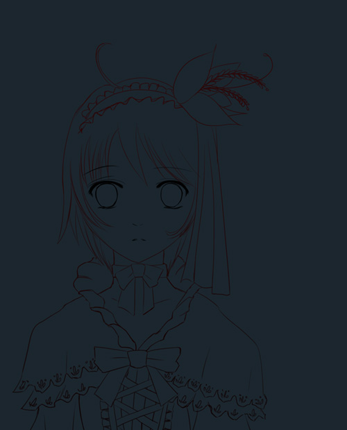
The first part is the line-art video:
[pro-player]https://www.youtube.com/watch?v=I8siQrqi4vA[/pro-player]
Try to guess what’s going on!
I’d like to say that the first video is dedicated slightly to Miette-Chan, since she had mentioned her interest in a certain game starring a certain alchemist. 😉
The ending line art result.
The second bit is the painting. This is where the image starts to really come together. Note the music, because it’s a bit of a clue. It’s also surprisingly well suited at specific segments! A happy accident! 🙂
[pro-player]https://www.youtube.com/watch?v=G0PN1nynXe0[/pro-player]
yesssss……
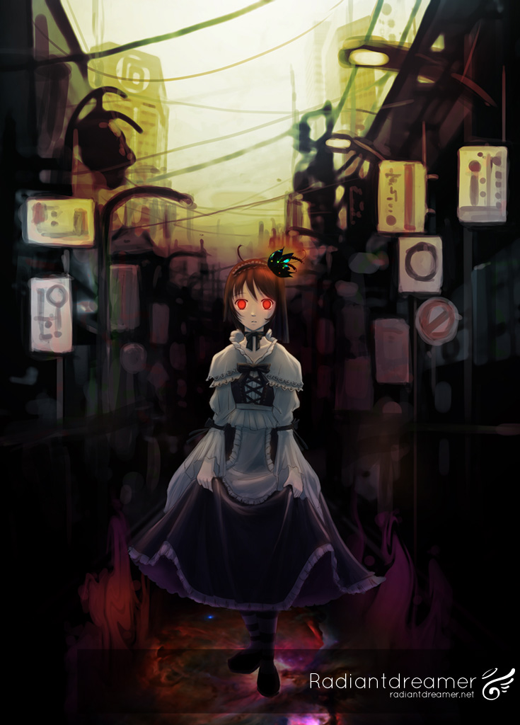
I’d have to say, I really like the end result. I’m satisfied with it…
I’m not really used to painting these kinds of works, so while a little intimidated by the idea, I’ve found that once you have a clear idea in your head, and you ambitiously push towards it, no matter what, you will get there.
Since my first Loligoth image was a bit of a milestone for me, in terms of taking everything I had learned at that point and and applying it to that piece, this is probably considered another “milestone”. How ironic that it happens to be another loligoth girl.
I just wished that these milestones would come sooner, but I suppose patience is key…
The end result.
This one is going into an art book for sure! … if I ever make one.
Totally Random Prizing!
Thanks everyone who took the time to write their New Years plans in my omg so totally inspirational! post a few days ago. I wish you all the best in making those plans come to fruition. I did mention that I’d be randomly giving out stuff, or something to that effect, so I decided to give away two items to the following people:

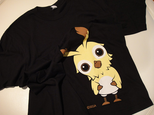
Ninjovee gets this T shirt from Phantasy Star Zero!
Your personal goals are commendable, but seem to require a lot of thought, so I wish you the best of luck in maintaining it! Hope you’ll like the shirt! 😀

Miette-chan wins a set of these Valkyria Chronicles pins!
I liked your plans for this year. They’re very realistic, obtainable, and ambitious. The self improvement aspect of it inspires me as well. Hopefully, when you see these pins, they’ll remind you of your goals!
I’ll email each of you to ask for your shipping address.
Cheers everyone! More prizes… whenever!


Congrats to the winners! huhu like the mood of the art ^^
thanx. ^^ I wonder where my art style will be in a year… hopefully even better! ^^
Congrats to the winners :).
I know exactly what you mean by milestones my friend. Sudden moments when what you’ve been trying to figure out suddenly becomes realized and makes sense. It’s like that missing ingredient to a great recipe. My other art buddies always referred to them as ‘aha’ moments :). I’ve been trying to get to one for myself, but it’s taking quite some time to get there haha. But I’ll keep at it no matter how long it takes ;).
I also loved the artwork. So moody, I had no idea exactly what way you were heading with it in the original sketch because there were many directions you could have gone :). In the end, I think the one you did choose was quite fitting. It may be one of the first of its kind I’ve seen from you too ;). Most definitely portfolio quality!
Take care, and best of wishes for 2011!
Now…where’s my pen again :D.
-Jason
iknowrite?! Sometimes, I wonder if it’s just fluke, because sometimes, it’s not repeatable. I actually did the Mirai fan art AFTER the loligoth girl, but the loligoth girl looks so much cooler. -_-; just gotta keep on practicing I suppose… I still haven’t finalized my new years plans yet…
Cheers!
I’d say in the end it was probably just a good day and the whole rush and euphoria of ‘I’ve GOT THIS’ affected the next work. Maybe it was from the excitement of a huge success–I know this full well because it happens all the freaking time to me :).
What I’d recommend is not to let your confidence slide because you didn’t like the following piece as much or more than its previous. If you ever doubt it, always remember you ROCK and no one but yourself can bring you down in the end :). I think both works are great anyway. There’s different moods between the two anyway.
I look forward to your many works to come in 2011 with much excitement. With true honesty I’m not trying to flatter you when I say you’re one of the best illustrators I know–it’s just a simple fact ;).
Let us know what this year’s plans are when you’ve got it done :). I’m interested in knowing what sort of changes you’re going to implement.
Keep up the astounding work and take care buddy!
-Jason
Dunno… it was quite some time between the loligoth girl and the Danny Choo one, so I can’t say that was it. Oh well, I have to admit that I wasn’t in the most comfortable condition when doing the Mirai piece. I should try again as soon as possible.
You’re right on the confidence bit. Gotta stay positive, and that’s not hard for me to do right now. 🙂
Thanks for sticking around and for the support, man. When people are able to motivate each other, it really helps!
This changed my mind about my classes, actually. Might have to stick with the graphic arts classes 😀
what were your initial thoughts about classes?
I had to go to Graphic Design classes, and submit sketches to get into Game Art & Design. I was kinda thinking I’d just leave school if I didn’t get into Game Art. But Graphic Design would just be a lot of classes that teach me to draw better, and that’s always nice. I think I’ll be happy with whatever route I take :3
oic. Keep in mind that “Graphic Design” is very different from illustration work. Graphic design involves more vector, layout, using graphic and text elements, textures, etc, and little to no involvement with drawing characters or objects.
As long as I can put those skills to use with my own characters and whatnot- It’ll be okie!
gambatte!
Really awesome artwork here. I love the goth loli style and this takes it to a different level. The background is dark and befitting, the eyes glow with bottled up emotion and the pose, face and outfit are superb. I would love to see you go ahead and make the artbook, you surely have what it takes to make one worth buying.
thanks persocom!
I kinda figured this would be to your tastes too. I really dig Chobit’s styles too. 🙂
I’ll work on that artbook thing. 😉
I definitely love the backdrop of this art. Makes me think of sign-filled streets in Hong Kong and Akihabara. I hope it isn’t too nitpicky but I think the waistline of her apron is a bit narrow. I first thought that the apron was the only part of her dress because her skirt kind of blended with the background @_@; but I think that’s just me.
Still, it’s a lovely painting ^^
and again, thank you so much for the giveaway! X3
When I was drawing this, a blend of Hong Kong and Akihabara was exactly what I wanted. Hence the huge attachment to the Ghost In The Shell music. It was totally inspirational.
About that apron thing, I can see why you’d see it that way. The apron actually is being covered by her arms, though the apron is also narrow because it only hangs out in the front. I don’t think I did a very good job of making that apparent. The skirt does seem a little too dark. It also depends on your monitor too. I’ll have to calibrate my monitor some point down the line for color accuracy…
Cheers!
I remember when I saw the thumbnail on Youtube, I thought hey that reminds me of Atelier Rorona, then I watched the video and heard the song XD. This girl reminds me a bit of the female Hom, although after the coloring this no where near as happy and fluffy as the game.
It almost seems in the second video as if the song is influencing the coloring as it goes along.
I did use Hom as my base for the design, actually. Made changes here and there, but overall, it’s fairly close. Considering loligoth styles don’t differ all that much, I figured I could just go with it anyway. It’s definitely deliberate, but good on you for catching all that! 😀
I could have taken this the other way into a happy fluffy thing, I’m sure! I think this has taught me that color and light does play a very important part of mood, atmosphere, and expression.
It almost seems in the second video as if the song is influencing the coloring as it goes along.
I never thought of it that way! It does seem like it! I should try that one day, find a song as inspiration, and paint something with it. I’d have to match the speed though, I guess…
Congratulations to the winners, and good luck in the new year to all who have resolutions. I did not make any this year. I decided that it is a bit over blown. ha/ha
Radiant, your talent amazes me. Artistic ability is one of the few things I envy others who have. 😛
Yeah, resolutions are overrated. It really doesn’t do anything to simply say “I’m going to play less video games” unless you have a plan to achieve that.
Thanks for the complement, Mike!
I LOVE the end result of your image! well I like almost all your artwork, I love going to my blog and seeing Joy there. She really makes the entire blog for me these days.
🙂 I’m glad you’re happy with Joy! I really enjoyed making that mascot for you. Maybe one day I can make one that’s event-themed, like Christmas or Summer, or something!
D: scary but nicely done overall.
the eyes for me are the main focus point or i should say the first thing i see O.o so glowy reminds me of hell girl even thought she doesnt have red eyes ^^;;
anyway naisu job!
yessssss…
yeah, I wanted the eyes to be the focal point. The perspective lines point to her face, her body shape points to her face, everything goes there. The darkness on the sides add to the claustrophobic feeling too.
Several things comes to mind in terms of this post. First and foremost, the lineart. I am surprised how far you were zoomed out and still was able to make really crisp lineart. I tried the same as well and turned out rather depressing that the lines were more like frenzy dashes that had to be zoomed out to look connected.
Are there any tips for hand-eye coordination in terms of the tablet? I quite frankly find your sketching ability to be wonderful and is something I would like to do one day eventually. My lineart usually requires me to zoom in a lot to get it accurate and look less detailed than yours even though much more time was spent. (example of a Valkyria Chronicles lineart from few days ago http://thenewhorde.deviantart.com/#/d36jir9 )
And what was your pen settings? It was hard to see from the video, did you have density pressure sensitivity checked in the advanced settings? I noticed you kept your first sketch density to be really low, but I couldn’t tell whether pressure sensitivity was on already.
That noted, I have been influenced lately by the black and white shading with colors painted on after. One of these days I ought to try to color the way you do, really like the lighting and mood you create in your paintings. My drawings for some reason tend to get too dark when I pick my shadows, always have trouble picking a good color for shadow without being too dark.
One of the most important things when drawing/sketching is to lay down the base first, and not concern with the details. You’ll notice that during the sketch phase, the frills and whatnot are just mere suggestions. I don’t refine it until I start laying down the ink.
In terms of improving your line art, you just have to practice more, and have more confidence in your strokes. Same with hand-eye coordination. You just get used to it after drawing more often.
The VC lineart you did looks pretty good. The main problem is that yes, you’re putting in the details too early, and you also haven’t established your character’s movement/weight very well yet. If you pull her left leg further back, it will look a lot better.
My pen settings is just using standard brushes and stuff. It’s nothing special really. More importantly is what you feel comfortable with.
The colorizing after tonal is pretty good if you can do it effectively. I tried a few times and I just can’t get it right. I’m sure it has a lot to do with my inability to see tone properly in grayscale. 😛
Start with lower contrast, and then tweak it later. Otherwise, if you go too dark too soon, you’ll have no room to move.
Lovely! I’m totally digging the atmosphere your painting creates. I’d definitely like to see what else you’ll be putting in your art book ^^
Thanks, xine! I haven’t decided whether or not to make an artbook yet. I don’t think I’ve got enough works that I could consider “quality” enough yet.
You are absolutely amazing.