Do you want to draw better lines? Ever wonder how other artists’ characters look so dynamic, yet your own characters look a bit static?
Drawing line art isn’t as simple as simply laying down some lines. There are a few critical areas that you should keep in mind while drawing, which I will cover here. And since not everyone has a tablet, I’ve made this tutorial applicable to pencil & paper artists, and will show you how to properly scan your line art into the computer.
(note, all the images are clickable to view at 100% resolution)
The first, and absolutely most important thing to learn about drawing lines is line quality.
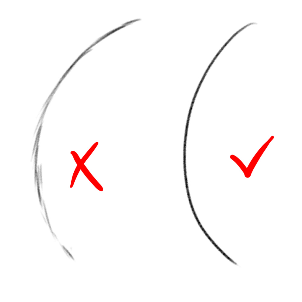
The line on the left is when you draw multiple little lines to form a single line. This is a typical and BAD habit that amateur artists make. This is mainly due to not having enough confidence in drawing lines in a single stroke. Ideally, you want your lines to look like the one on the right. This is accomplished by a single stroke.
As I said, it’s all about confidence. How do you build the confidence? Follow these tips:
- Practice! Simply draw arcing lines on a rough sheet of paper. Large ones that fill up the page. They don’t go anywhere in particular, but it really helps loosen your arm up so that you’re able to make those confident strokes. Just break out the sketchpad and have fun drawing lines everywhere!
- Draw lines slowly. This will improve your technique. You’ll get more “squiggly” lines when you first learn how to do this, but over time, you’ll get less and less squiggly.
- Draw lightly first. When drawing illustrations, drawing lightly will build confidence in your strokes (you can have a few line breaks when you’re sketching). Then go over the lines with a slower, more refined single stroke.
- Draw with your whole arm instead of just your wrist. You’ll get a much broader range of control and can draw much cleaner lines this way. It takes getting used to, but it’s the best way to draw.
The next important element to a line is line weight.
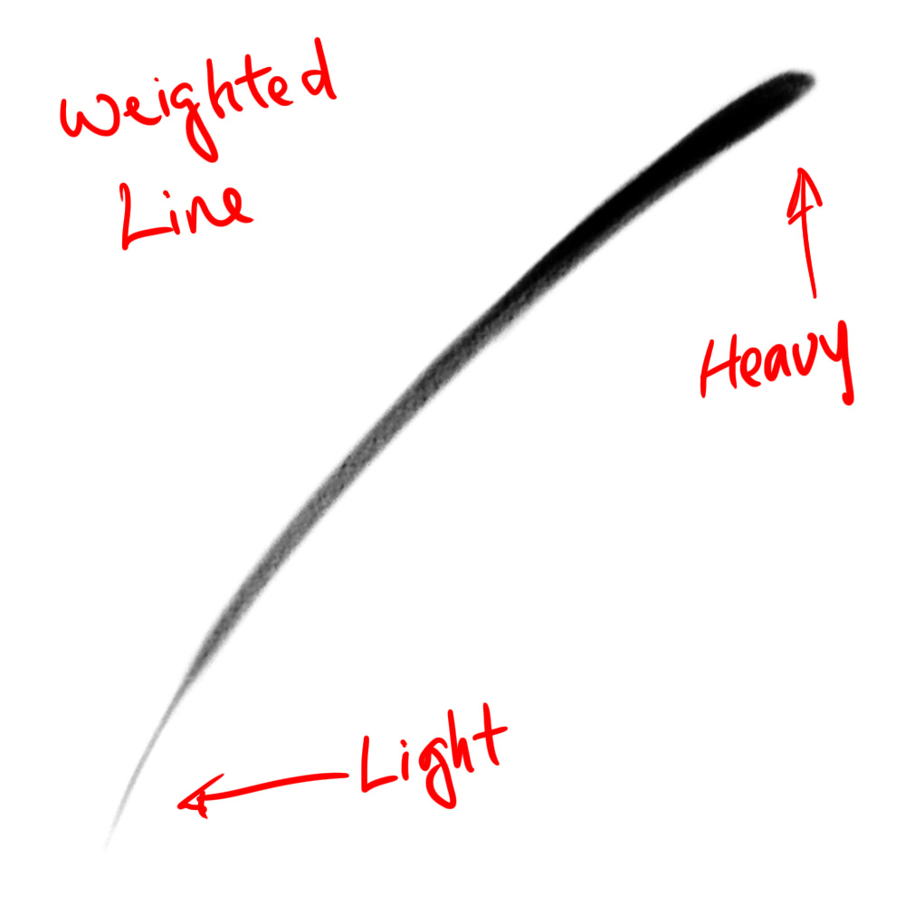
Lines have thicknesses. It’s especially important when doing line art, as it expresses weight, motion, and depth. With it, your line art comes to life. A thinner line indicates delicacy, while a thicker line indicates solidity. Likewise, thicker lines also feel heavier than thinner lines. They can also be used to express motion. Thin lines give a sense of movement, while thick lines do the opposite.
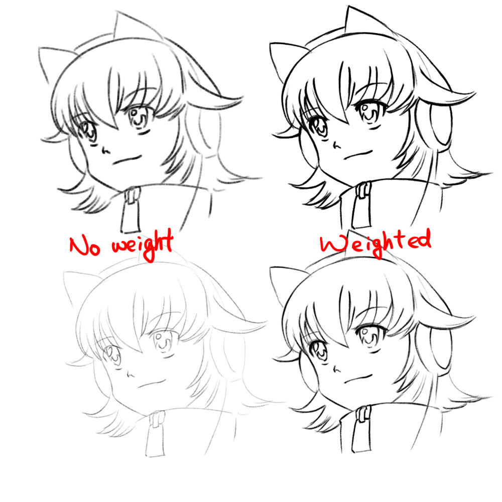
The images on the left have no weight, while the images on the right have weight. Relatively speaking, the images on the top are thicker than the images on the bottom.
You can see how the no weight lines look a bit dull in comparison to the weighted lines on the right. Even though the character is mostly static, the weight adds a bit of life to it. This is particularly important when expressing movement.
Once you have these two attributes of a line mastered, it’s time to put it to the test. There’s way too much to cover in terms of how to draw, so I’ll save that for next time.
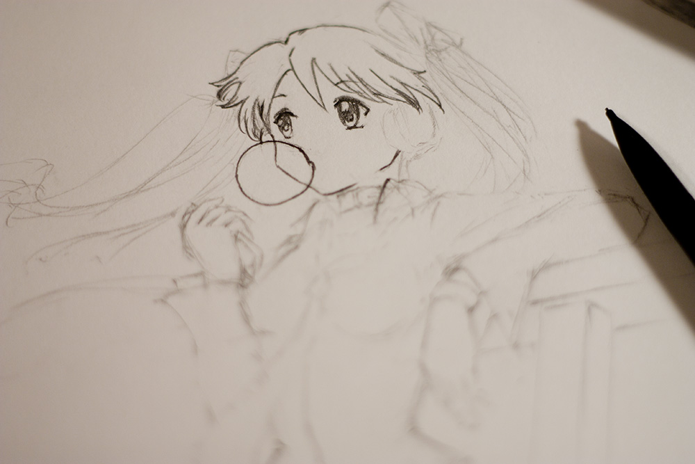
It’s not really possible to draw a good illustration with confident lines without having a base. You wouldn’t be reading this tutorial if you were good at that. Always start with a lightly drawn base sketch using a hard pencil. How loose or tight you want to draw is up to you. But this is the stage where it’s okay to make mistakes, and simply erase them, or just draw right on top of them.
Once your sketching is complete, use those sketch lines as a guide for your solid lines. Use a softer pencil and start outlining the lines you want to make stand out. Don’t worry about erasing the sketchy pencil lines. If you’ve drawn it light enough, it won’t be noticed compared to the darker lines.
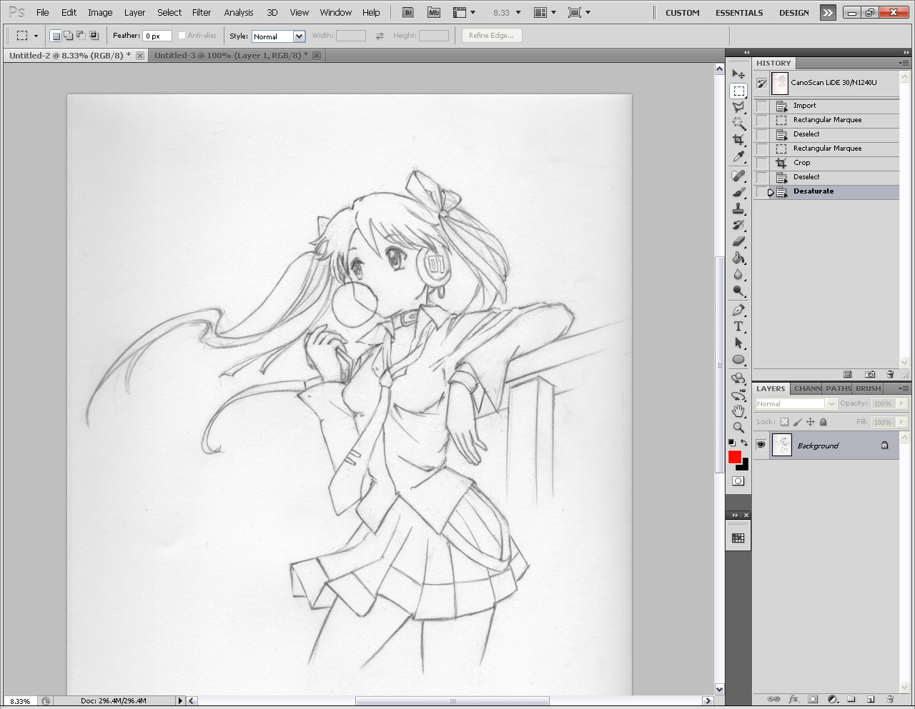
Once you’re done penciling, it’s time to scan your image. It’s important to scan as high a DPI as possible. DPI stands for dots per inch. The denser the dots per inch, the higher the resolution of your image. Some scanner software will try to auto-correct the image. Disable these. You want full control over this instead. Also scan in color. You can always convert it to grayscale within Photoshop instead. Basically, get the rawest true-to-original scan of the source as much as possible.
This is what the scan looks like. I converted it to grayscale. You can see that the edges are dark, the paper looks dirty, and there’s a crease on the bottom left side. All this can be removed. Here’s how to do it en-masse:
In Photoshop’s menu, click Image > Adjustments > Levels. You’ll be presented with a histogram with three little arrows under it. This histogram shows you all the pixels in your image, and where they lie on the graph. The pixels on the right side of the graph are all the white pixels, the pixels on the left are all the black pixels, and everything in between are grey. As you can see, there are A LOT of pixels in the light grey, with just a tiny amount in white. Practically none are black, but there’s a whole lot of grey.
Adjust the little black arrow. What this does is it caps the grey pixels, and narrows the range. You’ll see more of the grey pixels become darker, and some become black.
Adjust the little white arrow. This does the same thing, but to the pixels on the right. You’ll see more of the grey pixels become lighter, and some become white.
The little grey arrow is a median. It’s sort of like how many of those pixels do you want to be lighter grey, or darker grey.
The way I have it set now, I’ve turned a lot of grey pixels to white, essentially cleaning up most of the image, and I’ve turned a heck of a lot of grey pixels black, making the line-art more defined. I’ve also moved the grey arrow closer to the blacks to narrow the range further, and to allow more white pixels.
It’s still not 100% perfect. This is mainly due to how low-contrast the scan was to begin with.
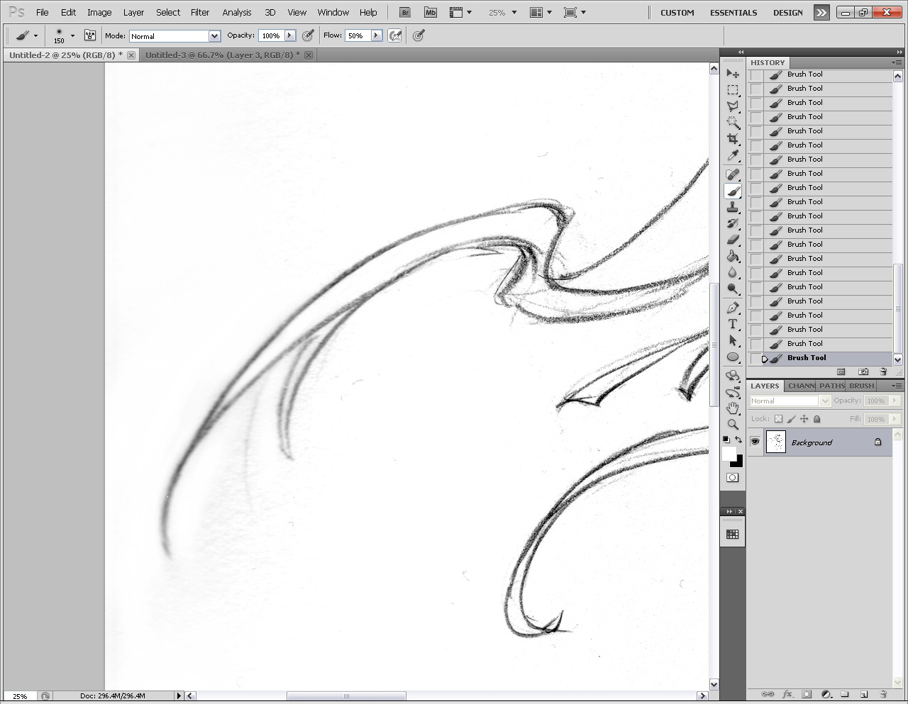
The rest of the grime has to be cleaned manually. Just take a white airbrush, and paint away. There shouldn’t be too much grime left after the Levels adjustment.
One thing I noticed after scanning the image was the right left side was slightly blurry. This is because the spine ring of my sketchbook was on the left, and it raised the image off the scanning glass slightly. Make sure that when you scan, your drawing is as flat as possible, or don’t draw so close to the edges.
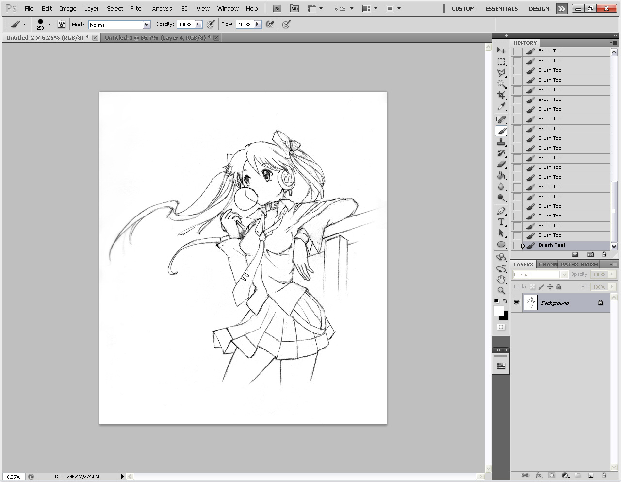
The resulting line art is much cleaner now. But as you can see, it still looks a tad messy. We’ll get back to that part later. Let’s continue.
Some people like to convert the background into a layer, and set the blend mode to Multiply. Then they start painting with layers underneath. This works and is fine for the most part. But if you want to color your lines, you won’t be able to do that. This next step will teach you how to separate just the black properly into a transparent layer.
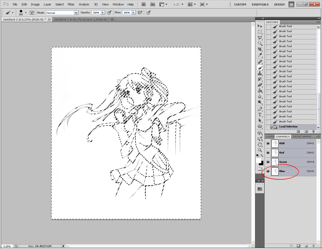
Open the Channels window. Hold Ctrl (Windows) or Command (Mac) and click on the Blue channel. This will select everything that’s not black. Why blue? It has a stronger contrast against Black, so it’s more accurate than the other two channels (which are slightly grey).
Next hit Ctrl+Shift+I to inverse the selection.
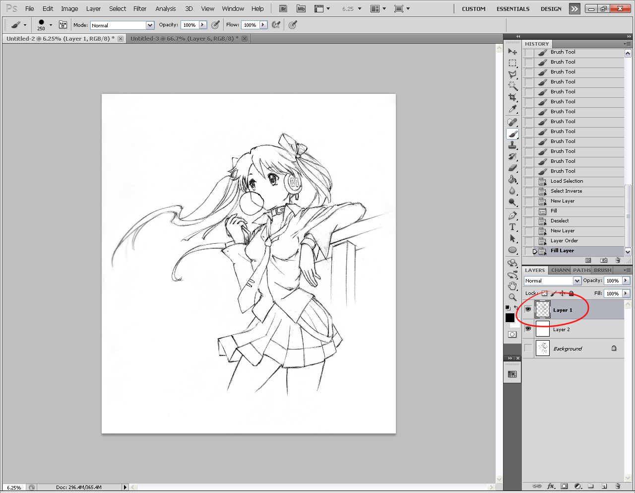
Go back to your Layers window, and click the New Layer button. The selection should still be active. Now hit Alt+Backspace to fill the selection with black. You may not notice anything different. But deselect your selection (Ctrl+D) and hide your Background. You should see the checkerboard transparency, but your line-art is still there. Start a new layer and fill it with white, or whatever color you want to play with.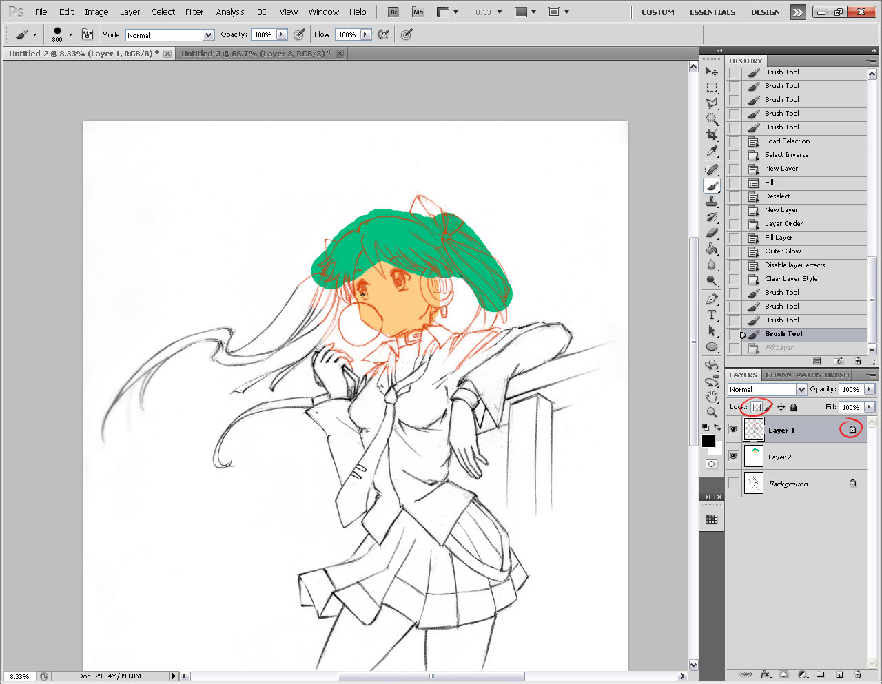
The main difference now is that you can paint over your line-art, and you don’t need to set it to multiply either, because the layer only contains the black pixels. To paint over your line art, simply click the little transparency lock button while that layer is selected. Now any color you apply to that will only go on the black pixels. The cool thing is you can color it however you want, or fill it back to black without causing any irreversible damage to your line art.
Another nice little test you can do is a ‘dirt check’.
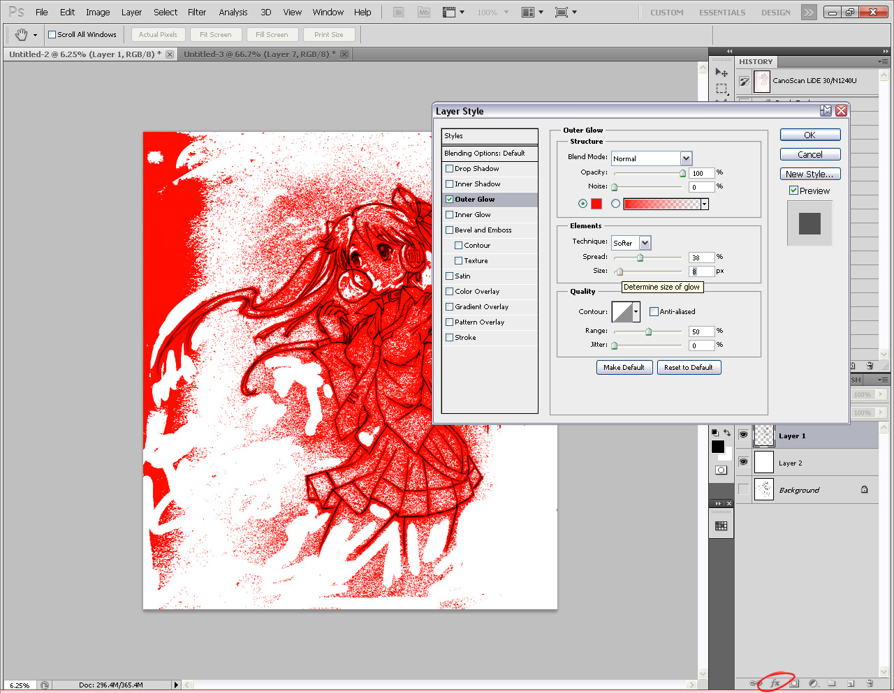
With your line art layer selected, click the FX button. Next click Outer Glow. Set the Blend Mode to Normal and play around with the Spread and Size. What I’ve done is “thickened” all the non-transparent pixels in the image to create a sort of “indicator” of where there is still grime. The solid white parts are the areas that I manually cleaned. Normally, you wouldn’t notice this level of dirt in an image, but it MAY be noticable if you use a lot of solid colors, and you zoom in real close, or possibly even when you print it.
So if you’re anal, you might want to fix it. But how? You could leave this FX layer on, and start painting away, until you’re satisfied, and then delete the FX layer, or you can increase the contrast of your source. You can do that by inking.
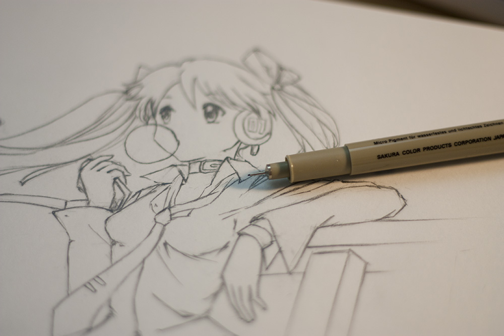
For inking, you need a very fine inking pen. For me, I use the Sakura Micron 005. These pens are the best you can get for outlining line art.
Outlining uses the same process as when you darken with pencil, and follow the same principles of line weight etc.
The only difference of course, is that you can create thinner lines with a 005, and you can’t erase any mistakes. (but if you’re scanning, it can be repaired).
After you’ve finished inking, you have the option to erase your pencil lines after the ink has dried. This will give the best contrast, but you lose some of the organic pencil lines. It’s a style choice at this point.
I chose to keep the pencil lines.
I repeat the scanning process, and adjust the levels. This time, I didn’t do any manual clean-up. This is the result of the dirt check. As you can see, it’s still a little dirty, but not a whole lot. I had to really crank it up. The majority of the grime is close to the line art itself, so that’s good. It’s keeping the majority of the space clean, while still keeping the lines natural looking.
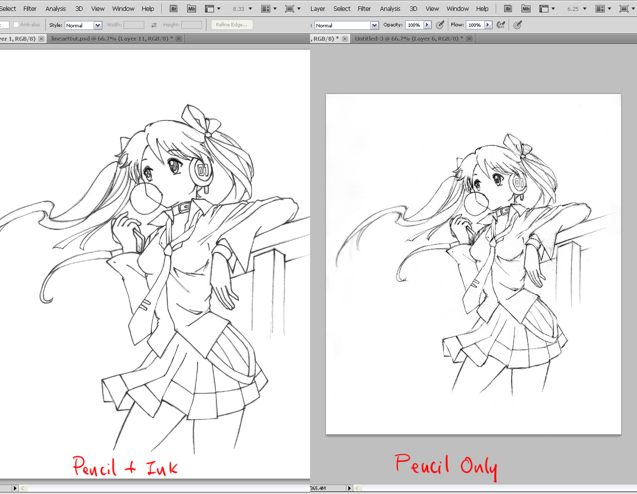
A comparison shot. The ink really helps in solidifying the drawing, and since I used thinner lines than the pencil art, it still retains the natural pencil look. The image on the right is pencil only, but because of the low contrast of the source, I wasn’t able to get as clean an image.
I could have gone further, and really lined the ink, and erased the pencil before scanning. If you want something that clean, then that’s great. Since I have a tablet, I can also do my inking digitally at this point too. By keeping the pencil lines, I can fall back to this if I want to, because once you erase those pencil lines, they’re gone for good.
If you enjoyed this tutorial, please share this by clicking one of the buttons below!






Whoa, nice tutorial! Just what i need for now. Thanks for sharing it. ^^
Same goes for me 😀
A Firend of my asked me to colorate her picture and this tutorial helps with a lot of things there. Domo arigatou Radiant-sensei.
( ‘.^)_’o
Sweet! Glad that it will be helpful to you! 🙂
It’s been forever since I seen a tutorial on digital painting. I guess learning to draw anime is not in vogue. I’m glad that you spoke about scanning and touching up the drawing before even doing any type of digital line work. Usually when I see line art tutorials they just go on ahead to showing different methods of doing it.
Hopefully this is the first of many tutorials.
I noticed that too about other tutorials. I think their main thing is to just get the linework done, and figure that the scanning part is trivial, when really it isn’t for a lot of people.
I’ve done other tutorials before, but I guess this would be the first proper drawing tutorial. I’ve definitely wanted to do tutorials since the migration of RadiantDreamer, but it’s actually quite time consuming! This definitely won’t be the last though.
Thank you! *shares*
*like*
Very nice tutorial dude! I would not have the same level of patience and skill to do this! (where have I seen that line before?) Seriously though, I struggle to draw a circle so a full image is beyond me!
lol I think I used that line when I complemented you on your awesome GK painting. 😀
Indeed. I guess the grass really is always greener on the other side!!
Well then, this is really quite good buddy :). Also very glad to find that there’s someone else that likes the natural organic look of the pencil lines with the inked line art. I mean, it may look a bit more messy, but let’s face it. The closer to perfection something becomes, the less organic it appears.
Too clean and it looks too machine-like, imo :). I’ve always believed that one of the trademarks between artists is not only where their work gets a little messy, but also how they incorporate it into the whole.
I suppose the only thing I could add is to build confidence and skill one should not only practice a ton, but try to establish some form of structured regimen (Albeit not too stiff, it’s better to be loose with it, but don’t just practice with no aim is what I’m saying :)).
Another thing would be that one should perform master copies (I.E. Copy what you see from anime or manga). Now of course, you can’t use these copies for monetary gain since that would be copyright infringement, but using it for personal gains on skill is totally different. I remember about 50% of what I did in college were master copies. Find an artist whose style you find interesting and try to mimic it is what I’m basically saying :).
I’d say to do this as much as copying the entire scene, or the entire page of a manga. You’ll learn not only a new style, but also how an artist achieved some form of emotion or even a new pose. Even new scene ideas too. And we all know we can’t be without more of those ideas :). Anything to influence action is a +1 in my book!
And lastly, probably the one thing rarely ever mentioned. I believe that to become better at ‘anything’ it’s important to become immersed into it. In this case, that involves watching/reading anime/manga. I think too few understand how important it is that you don’t just practice by doing, but you practice passively by being around it. Not to mention being influenced and inspired to try new things :).
Oh, on a final note, it’ll greatly improve confidence if you pass around drawings to others who, like you, are interested in such things. Some might become a bit–or overly–critical, but don’t lose hope. Critique is the hardest thing ever. Once you get your stuff out there it gets easier. I mean hell, originally I would have kept to myself and never shown a work I made to anyone (even though that was the purpose to begin with). Once I started to though it grew easier and easier to the point where it was almost like breathing and critique didn’t bother me so much even if they were terrible critics (I.E. The kind that simply says, “It sux… nuff said” without any constructiveness).
Extremely long comment I know, but my 2 cents :). I’ve got a lot to say on art based topics hehe.
Take care buddy! Great addition and hope to see more in the future! 😀
You are so right about that, my friend. After looking though my artwork, I’ve found that the most dynamic and alive works I have are usually the looser ones. I think when I drew Awesomesauce Girl, I tightened my lines up way too much, and also used a brush that I wasn’t familiar with using (hard ink brush).
I like your tip on structured regimen. I myself have to get into one. I don’t draw nearly enough. Too busy playing Persona 3, I guess LOL!
I used to do master copies when I was younger, and you’re right. It really helps. It’s a tip I give people too. You improve significantly, but of course the downside is your art starts to look like the one you’re copying.
Thanks for mentioning all the great tips! I hope the other commenters will read it too! I may incorporate these into a future blog post and build upon it. :3
If the tips help others I’d be most happy :). I’m more than happy to relay my thoughts on such things if I think it could benefit someone :D.
I feel a little like you in that regard–minus the skill or professional experience that is heh. I might have a decent amount of knowledge, but my actual skill level isn’t anywhere close. I guess that means I’ve gone 1/2 the journey since it’s better to know what not to do so that you don’t develop bad technique or increase skill faster. Who can say? O,o
Totally agree with you on the master copy bit, btw. Ever since college I forget when the last time I made one was hah. Kinda sad really. I should really start doing more again. Hell… I should really practice what I preach more and draw a lot more.
Hell… I should really practice what I preach more and draw a lot more.
You and me both, brother!
gez, I only ever scanned a image once and colored it fully on photoshop. wait make it twice but it didn’t looked nice; but anyways… http://mi3star.deviantart.com/gallery/#/d3cxw2i
but I may try drawing and scanning it again one time;; specially with the whole dirt thing rofl xD
the only issue though; I lack a few pen ;_;
so I’m going to be using a normal pen for inking…
If you ever have the chance, try out a Sakura Micron pen :). They aren’t that expensive and you’ll find that it glides and applies much smoother than most normal ball-point pens. Plus, like Radiant mentioned, you can achieve different thicknesses by altering the pressure you use.
They’re somewhat similar to sharpie pens.
The only downside to these pens though is that you can’t refill them when they run out of ink :\. Although it’ll take a decent amount of time for that to happen.
All the best! 🙂
Normal pens are okay. It depends on what kind. Ballpoint pens are hit and miss. The cheap stuff that come in packs are generally not good, because you can’t get very good variable thicknesses from them, and their thinnest is still pretty thick. However, if you get something higher quality, like a Cross ballpoint pen, then those things are GREAT. You get excellent control, and can draw REALLY thin lines as well as really thick lines.
Definitely give the Sakura pens a try if you get the chance. They’re great too!
Thanks for the tip I may go out and buy some next time :]
whoa, thanks for sharing this! I’ve been struggling with lineart for…a long time now!!
I’ll definitely note those tips down and give them a go >v</
Thanks for reading! Please share it with others if you find it helpful!
Great tutorial. I’ve been wanting to learn how to draw well for years now, but I can never find the time to practice. The funny thing about lines is that I actually get a lot of people telling me two opposite things. Some say featuring is good, while others say you should go with solid lines. My preference is to use solid lines when I’m drawing something relatively straight and feathering for curves. When I’m done, I always smooth out the lines.
Thanks, Nopy. It really is all about practice.
It’s really hard to draw a curve without using multiple strokes, that is certain. But the fewer strokes you use, the smoother and cleaner it will look. Whether they are right or wrong… well, just look at other professional artists, I guess. 🙂
Yes, the technique of feathering and then smoothing out the lines works. The feathering sketch helps guide your line when you smooth.
Hah!!! I think the line art tutorial will be useful for me in the future. Sorry not for now because really hard to squeeze out some time to draw, even through I already buy the drawing book. Will procrastinate for a while….
But the photoshop part is confusing me a lots since I don’t have this software and never use or see it before at anywhere.
Before this I always wondering why the characters I draw looked so stiff, now I can think the various reasons of why. Don’t think want to write at here as there reeaally A LOTS. But the main one I think it is because I just simply no confidence, no practice and no base.
What I draw always in “feathering” and very shallow lines.
Looking forward for the next tutorial. 🙂
It takes a lot of practice to get over the confidence issue. Once you do though, the “feathering” will stop. The confidence will show in your drawings too!
Wow your tutorial really helps! Usually I feather a lot but I guess I should build up some confidence huh. I’m kind of a newbie when it comes to photoshop and I don’t really know where to begin. Have any suggestions/recommendations to where I begin learning? Oh and have you ever tried Copic Multiliner pens before? They’re pretty good and are refillable but the draw back is that they’re pretty expensive…
Thanks for your tutorial! =D
Glad that the tutorial helped! Yes, it’s definitely building confidence that will help with the strokes.
Photoshop takes a bit of learning, for sure. There are resources out there for sure. Actually, check my tutorials section. One of the first tutorials I did teaches you how to do photoshop compositing. I explain each step clearly so you know what’s what.
Yeah Copics are cool. 😀
this is a brilliant post, so very useful. i can never grasp the lines, thanks for this although it’ll take a lot of skill to eventually get to that point. this almost felt like a direct response to the previous post i made here. i can never draw lines like that, man, this is a really nice lineart!
i also like the poses you come up with, they feel natural and interesting to look at, how do you come up with ideas for your poses and items your characters carry?
thanks for this post! *bows*
Thanks. Yes, it totally does take time. But I think that you’re going in the right direction already. There are a few pieces on your deviantart that I quite like. 😀
The poses are sometimes spontaneous. Sometimes, I have a clear picture in my mind what I want to draw. It used to take a lot of effort to translate those minds’ eye images onto paper, but it’s become easier with practice.
In terms of items, is usually is “whatever comes to mind”. lol!
I hate to retweet this when i first saw it!
The walk-through and tips are amazing, when i used to draw, lineart never was and probably never will be my strong point, this however is a God send haha
Thanks for the retweet. I could always use the support/exposure! 🙂
I’m glad you’ve found the tutorial helpful!
Never say never. With practice, it CAN be your strong point. 😀
I sometimes still draw with multiple light lines and I think it makes my work look rather messy. ^^; Thanks for sharing this and hopefully with practice I’ll be able to sketch confidently and maybe even teach the Little Toy Pusher someday.
The multiple light lines can look messy if there’s too much, but I think it adds to the overall image and makes it look natural when done right. 😀
I look forward to seeing Little Toy Pusher’s first drawing! Hope you’ll treasure it, unlike me lol!
It will take me months, of even years to be able to grasp this.
althought i got myself a certificate in design. that is definetely not enough to be able to draw like you and thats a fact.
Ill saw this to a friend of mine who is into drawing this kind of stuff. hell be amazed.
Perhaps, and sometimes that is what it takes to learn/grasp. I know I still am in that process of learning/perfecting it.
Design and illustration are two different things, IMO, so please don’t feel bad if illustration is something you can’t do. I can’t design worth crap. I really like what you’ve done with the Big Feature theme. I can’t even fathom how to do that. You know, I think we can compliment each other well on that regards!
Hope your friend likes the tutorial! 😀
Despite the fact i draw almost every day, i still can’t sketch correctly, at the point that it seems i draw only from few monts instead of years. When i asked for help people always answered me ‘just draw, you will sketch cleaner spontaneously’
But i still sketch badly as i sketched 10 years ago.
The question then really is how often do you draw? The other artists are correct. Just draw. It’s all about practice. And practice requires frequency.
If I tried to learn how to ride a bike for 10 years, but only try once every four or five months, I will not have learned how to ride a bike. The same goes for drawing.
The whole answer about ‘just drawing’ is actually correct but sometimes it can be misleading. The reason for this is because it’s not simply about ‘just drawing’ but rather having an effective regimen to improve. It’s somewhat like weight training. You have to have a form of a regimen to work specific parts of your ‘artistic’ muscles. There are workouts that train the eye from observation letting you judge distance, scale, and proportion better. There are also workouts designed to get your technique better through constant practice of drawing shapes, lines, and shadings. There are workouts designed to improve you ability to get what you see in the mind’s eye on paper.
The other thing that’s similar to weight training is the intensity that you practice drawing. Similar to the whole rep and set system in weight training depending on how long you focus on drawing a specific work (The artistic rep) and how many of these drawings you do (The artistic set) will determine if the practice was beneficial or if the gains given were little.
I had an instructor that once gave her student an assignment to draw 120 drawings of the same drawing over the course of a week. In the end, he improved from it. I understand that not everyone has the time to work on 10+ drawings a day, but it’s one way to get better :).
I can even say this is very similar to playing a musical instrument. I play guitar and one thing you have to do is practice modes, chords, timing, rhythm, transcribing (listening to music and playing what’s played) and articulation/technique (Speed/Clarity of notes). You have to generally practice each of these at least 15 minutes a day to get better at it, but you don’t have to focus on all at once. But the more time you put into it the better. If you practiced it for only about 30 minutes total time you’ll only stay where you’re at. But if you practice up to close to 3 hours a day you will drastically improve.
So, what’s this already long post saying? First off, don’t give up :). Second off, if you’re not finding any gains for the amount of effort you give, how much of it are you giving? Remember that if you just practice the same thing every time you won’t really improve quickly. Doing the same thing time and time again and expecting a different outcome is considered ‘insanity’ if I recall right.
Generally I find I have to put in at least a 30 minutes to an hour to keep my skill where it’s at. If I practice longer or much longer though I improve. It’s all about muscular motor memory. The better trained your body is, the better you’ll be.
Also, remember that if your technique is what’s ailing you (getting accurate strokes, clean lines, no squiggles, getting that imagined line/shape on the first go) that it’s your physical application. For this, it means you need to practice drawing simply shapes and lines on entire pages and over time you will improve. I recommend using some disposable paper for this though like printer paper or newsprint paper.
Best of luck to you! 🙂
Hope you find something useful, and keep sketching! 😀
Hi! I just wanted to say that I love your artwork. I’m practicing learning anime, but at the momen’t i’m not too good at keeping the proportional stuff in balance. Do you think you could do a turtorial on keeping proportional when drawing the body? And one learning how to color and shade in the right places would be helpful too. If not, I understand. One day I hope to become as good at drawing anime as you. Have a blessed day!
Sincerely,
Julie
That is one heck of a polite request, gotta learn how to write like you. My writings are just too blunt and offending sometimes even when I reread what I write and tries to fix it.
Well, that’s beside the point. Radiant, I second that request, mostly just for the shading in the right places. XD
Thank you ^.^ I hope you have a blessed day too, thenewhorde! Well, everyone for that matter 🙂
Hello Julie. Thanks for commenting, and for writing me that lovely email.
I definitely intend to do a tutorial on proportions down the road – when I have time. ^^; I’ve been pretty busy lately.
Thanks for visiting!
This is great! This helps me a lot. I’ve always really been into watching anime and reading manga and have recently gotten into drawing. Would you have any recommendations for any brand/model of tablet?
Who me? I’m guessing that you meant to ask radiant that, but I just got a message saying you had replied to something. If it helps, I use a Wacom Bamboo (touch and pen) Tablet. You should check out all the Wacom Tablets, I find them very helpful. But that’s just me. Have a blessed day!
Sincerely,
Julie
Wacom tablets for sure. Bamboos are the cheapest, but for a reason. Intuos are the professional ones, and if you’re rich, Cintiqs are the best.
This is probably the best lineart tutorial I’ve seen. It revealed many mistakes I didn’t notice I made and how to fix them. The main problem I had was my lines were messy and the lighting of my scanner would ruin everything. Again thank you so much for this ^^!
You’re welcome! I hope you will continue to visit my blog for other drawing tips!
love ur work, what program do u use to do ur work? photoshop?
Thanks. Yes, photoshop. Be sure to check out my other stuff on facebook and youtube! Cheers!
I feel so stupid for asking this, but how thick is the Sakura Micron 005?
I meant to reply to your post, but I forgot to hit reply. My comment to yours is down below in the next comment.
My bad >,<. Oh, and sorry about that Radiant. Didn't mean to goof up like that.
Don’t feel bad :). There are no dumb questions.
A Sakura Micron #005 is about 0.20mm with it’s pen nib. That’s very, VERY small. The smallest one I use, for instance, is a .30mm from a Sakura Pigma Sensei set I got.
You can find out more about them here at Sakura’s website: http://www.sakuraofamerica.com/Pen-Archival
—–
This is just my personal opinion, but I find that it’s easier to use larger pens than smaller ones. The reason is because a larger nib will give you wider variation with line width based on your pressure. This does take quite some practice to use well though.
I personally use a .60mm one from my set the most.
Also, I’m speaking from using only their brush nib pens. I’m not sure if it’s the same with the other kinds.
Above all else though, experiment and find what works for you :).
All the best!!
thankyou!! this was so helpful! 🙂 x
What is this machine that can put ur picture anime thingy into the laptop so that you can fix?
and where can u buy it at?
This is a great tutorial.
Ive been a very self-conscious, perfectionistic (is that even a word, lol?) and very depressed “artist” with many mood swings regarding me not understanding others due to my autistic leanings, as well as my fear and worry that no matter what I do I will never be a good artist; seeing those who use photoshop so easily only added to my anxiety and ever since I became a member on deviantart, Ive been surrounded by many multi-talented artists who made me feel like a shrinking violet in comparison. Ive held onto these toxic feelings for three years.
But I decided to scan my drawings on June 20th, 2012, and that day will be a fricking anniversary. I uploaded them on DeviantArt, and messaged a very very talented Photoshop anime artist, Ireal70. I basically said to her “Im a frigging emotional wreck and I know you probably couldnt give less of a crap over a rube like me, but could you please look at this drawing I made and tell me what you think of it? ;_; ” She told me it was okay, and that the pose I chose was very difficult (it was of a naked woman clutching a long ribbon as she tilted her neck back to look at the sky..) BUT she said she was impressed by the accuracy of the folds and creases of the ribbon fabric! She nicely suggested I keep trying and use Photoshop, since after she first started using it, she never went back.
So I am a “new” person now, hopefully. I promised myself I would draw, scan, and use my Tablet –one day– to fix it and color it in..
This tutorial makes the huge scary, seemingly impossible multi-thingabob-and-widget program seem less fearsome and intimidating.. though even though I took a class in photoshop, Im still nervous about going at it without any guidelines or pre-prepared projects for me to go through..
But enough about me (sorry about that). What I truly wanted to say was yoy’re adding to my confidence as a born-again artist. I WILL make everyone proud, my friends on DA, Ireal70, and you, person whom Ive never had contact with until now! Just you wait! 😀
awww! I’m happy that I was able to make a small difference in your life and help you on your way! I look forward to seeing some of your artwork! Good Luck! 😀
I want you to know your not alone I am completely in the same boat as you are. Also autistic here and feel the same pressure as you. Hit me up on deviantart if you can my user name is the same as above. Take care.
Does the type of paper you use make much of a difference to the quality of the scanned line? should I get some super-smoothe paper or is just ordinary paper fine?
thanks! 🙂
it actually does make a difference. Smoother paper will “grind” your pencil less, resulting in lines that are less “fuzzy”. Comic book layouts use super smooth paper, for example.
I’ll go get some smooth paper then 🙂 thanks for the response 🙂
I wanted to say thank you so much for this! I’ve always been frustrated at my own work because I had no idea what I was doing but now I can see what I need to do and work on. From the bottom of my heart thank you!
You’re welcome! I know an autistic friend too, so I kinda understand your frustrations sometimes. Glad that my tutorial is helpful to you! It’s seeing comments like yours that makes it all worth the effort! 🙂
Very nice tutorial – covering basics and explaining “what and why”, not only “how”.
I like it for few more things:
– You don’t show typical Pen Tool inking, which is pretty simple but can take way more practice than quick sketch purifying you show here, and the result may be a bit to “cartoony”/vector-like or – what’s worse IMO – look like clip art.
– You teach operations on channels and show the uncommon way to use Layer Styles, which most beginners use as “cool_and_fast_effect_adding_tool”. Go deeper and try Image-> Mode->Lab (channels will change to L, a and b, where L layer correspond to Lightness, while a/b layers correspond to color range). Copy L layer and switch back to RGB mode (Image->Mode->RGB)Your Layers will now switch back to Red, Green and Blue, PLUS Lightness Copy, as additional layer 🙂
Then go to Image->Calculations… and experiment with combining this channel with other ones (like Blue) with different blending modes and opacity percent.
Don’t worry about loosing or corrupting some of your original channels – after hitting OK, the Calculations tool will give you another channel copy, which is an outcome of your experiments with merging channels. You can use that channel copy to select your line art or as the layer mask…
– You show more ways to improve line art, it cover not only digital, but also traditional media usage, like REAL inking, not Photoshop brush inking.
I would like to see some hints about how to improve your TABLET line art like clear strokes (without doing those “not-confident” short lines). It’s completely different experience – drawing strokes with pencil-paper contact, where hand-eye coordination is way easier to train and master, than tablet drawing without looking on where you put your digital pen, but following your mouse pointer on the screen (which is different then hand-mouse eye-screen coordination, and experience may differ even caused by different angle you put your tablet or holding your digital pen).
Greetings (and FB Like of cause 😉 ).
Hey thanks for commenting! Yes, indeed I tried to keep this tutorial very simple and easy to understand. I may go into doing a vector/pen tool tutorial in the future if need be, and yes a very good idea on doing a tablet line art tutorial!
Thanks for dropping by, hope to see you again soon! 🙂
Wow. If copying my fav artist’s art will make my art style looks like their artstyle, i’d like to try that. Thank you for your tips dude.
I know I’m like, a year late lol but I got a question: Would I still be able to do all this with a phone camera? I have no scanner so it’s quite troublesome ;_;
And I’m like 3 months late replying! 😛
A phone camera could work, but it’s nowhere near as good as a scanner – because your light will cast a shadow on your page, making it look uneven, and VERY difficult to clean in photoshop. Plus, you have other things to concern about – like wrong angles causing perspective problems, camera shakes causing your image to look blurry, camera lens distortion, and of course, the limited resolution of your camera.
This tutorial is really gonna help me a whole lot, so thanks..but I had one question. does this mean I dont have to actually ink a sketch? like I can just scan the penciling and darken the lines with the image adjuster?
That’s correct, you don’t have to ink. But, you will get much better results if you do ink. Because once you scan it in, you’ll find it really hard to clean. The post talks about this – the difference between scanning a pencil drawing, and scanning an inked drawing.
I feel like i’m doing something wrong!! I use micron pens for inking. Then i use art markers to color! but the art markers make the micron and/or smear!! I’ve ruined a couple pictures because if this. Even if the micron inking was done WEEKS before the coloring took place. Some one help!!
Yeah that happens. They’re not exactly permanent. It’s a chemical reaction in the art markers. The only thing I can suggest is don’t do the inking until after the coloring is done – so have your final lines in pencil, color, then ink.
All of the responses that you have received from this posted tutorial should give you all of the info that you need to know that it got the attention from the entire spread of wishful artist all the way to the well experienced.
I would like to just thank you for taking the time to do all of this work and getting it out to anyone that may benefit from this exhalent tutorial.
Some individuals may of sounded condemning but because you took the pains to put this together we have their input as well; so please do not let any of that deter you from being so very helpful to all of us who if we would take the time would thank you from the bottom of our heart.
Its nice to see the comments here are so polite, it fills my heart with joy. Anyways, thank you for this very well explained tutorial, I was just searching for how to draw lines better, but this helped me much more than that.
I have been wanting to draw anime style art for years, and Ive started about 10 months ago, but never really practiced. Although it seems that everyone who draws anime tells me that i should learn about human anatomy and a more realistic style before diving in to anime style. Is this true? I mean I want to be acurate when I draw body proportions, but how much time should be spent on each style? Is it ok to practice realistic art AND anime simultaneusly? Thank you in advance. 🙂
I don’t really know about practicing them at the same time, but I think that you can practice them at the same time and it will turn out fine. Anime is fairly realistic when looking at the proportions, and I think knowing how to draw realistically will probably help a lot. However, I can’t draw realistically and only draw anime style and (I think) my art is fine. I hope that this is a good answer to your question.
Thank you so much for this tutorial :)! Very well written and so easy to follow! I scanned my inked image and followed the steps exactly. I was soo happy when I saw my lineart all selected, I did it! Then I played around with the colours and it looks awesome.
Any suggestions for a good line colour that isnt black, for a more natural look?
Also guys it’s so beautiful to read all the comments and see everybody being so encouraging of eachother!
As artists we never feel fully confident in our work and it’s so easy to see other peoples amazing work and feel down about it and like our work is not good enough.
We just need to remember to learn from those who inspire us and to praise ourselves for the things we can achieve!
😀
Thank you for this! I really needed steps in PH which help to clean the image, and I found them in your tutorial.
I like your post, but I do not use G+. If you don’t mind, I will share your article at my deviantart page 🙂
Very nice tutorial, yes this is very essential. Not a lot of “how to basics on handling lines” around anymore.
This tutorial is exactly what I was looking for!
Thank you! 🙂
Thank you for this tutorial! I’ve always looked at artists that draw super well, and then I try to imitate them but incorporate my own style. Unfortunately when I try to draw line art, it comes out fuzzy and bad looking, so I wanted to learn a way to make them look better. I think that before I start my line art it looks fine, but after it turns out bad because of the fuzziness. This really cleared up what my problem was and provided a solution. Thank you so much!
nice XD btw what do you mean by hard pencils? Is it EB or something? Please do reply..I really appreciate your tutorial, it enlightens me :3
*NB : if possible please reply me via facebook 😀
‘m not really enjoy anime but I feel interested to drawing manga since I was in elementary school 😀 because I can see it everywhere (Manga is cute). And all of your tutorial really helpful for me (especially in youtube). I wish you will post some tips for digital painting (how to blend colors, how to choose right brush, etc) It’ll be very helpful for readers.
I love to see your amazing galleries. I feel jealous, but I realize that all I need just do more practice.
Keep up the good work and sorry for my bad english, I hope you understand my comment XD
I am really good at drawing. And my drawings are anime. But when i search up anime i feel like my drawings don’t look like actual anime. Is that natural?
Wow thanks Radiantdreamer, just what i need now 🙂