This isn’t the first time I’ve done fan-art. But this is the first time I’ve tried to make fan-art look like official art. While it’s not quite to par with official art, I’d say I come fairly close. More pix and video after the jump!
Neogaf is having a contest. Well, actually it’s more like Arc System Works Europe is holding a contest hosted by Neogaf. So I’ve decided to participate with heated soul!
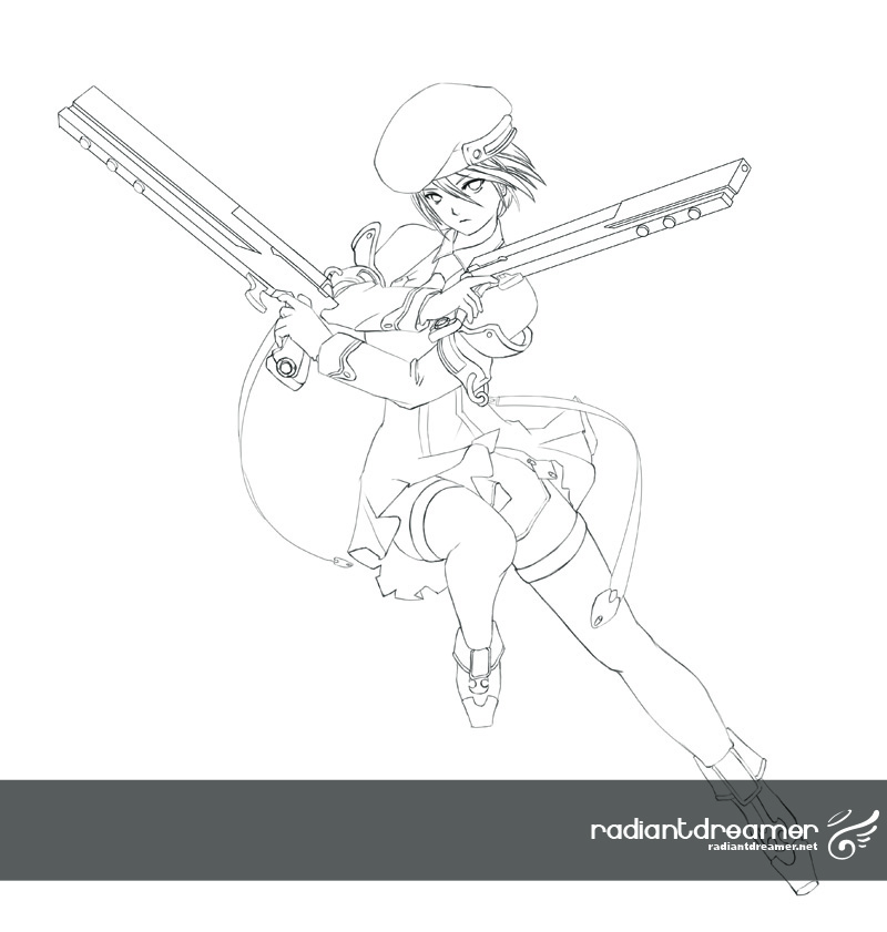
From the get-go I decided that I wanted to draw my own cover as opposed to simply compositing official art into another cover. The problem was that it would be a harder sell, and may not be marketable. Well it’s pretty obvious that the official art is marketable, so I aimed to mimic it as close as I could. To start, I sketched out a layout of what I wanted the cover to look like. But instead of revealing the entire cover right now, here’s the sketch of Noel I made:
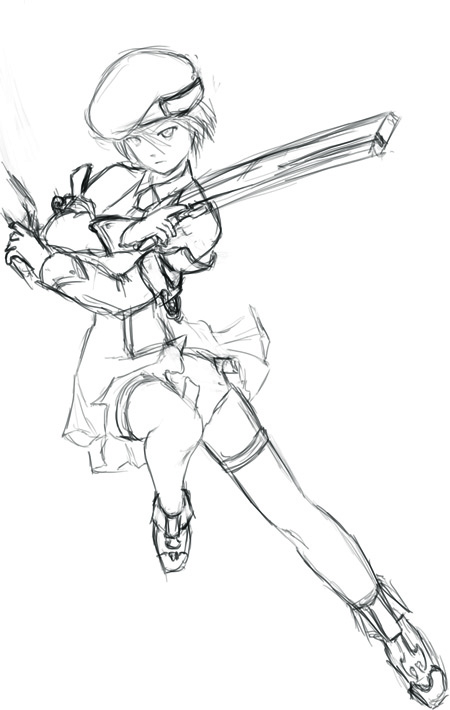
After spending about 3 hours, this is the cleaned up line-art:
This is the reference image I used for both line-art and coloring:

I basically had it side by side, and used the color picker to pick highlights, midtones, and shadows, and tried to mimic the shading style as best as I could.
I think that I started off too low resolution. It’s basically 600dpi (I sketched it in 300dpi, and then scaled it up 200%), but I think I should have gone with 1200dpi to get finer and cleaner lines. Well, lesson learned. I’ll probably keep using 600dpi for the rest of the cover, otherwise it would look unusual that everyone is crisper looking than Noel.
I took the time to record a time lapse video of the entire thing. It’s playing a little fast, I know. I’m using a new program, so I’m trying to find an optimal time speed. I recorded this at 1 frame every 2 seconds, with a playback rate of 30 frames per second. This essentially means that every 1 minute of footage equals to 1 hour of actual work.
The video is 6:30 long, so that’s 6.5 hrs of work here. 🙂
[pro-player]https://www.youtube.com/watch?v=nOdypkYzCC4[/pro-player]
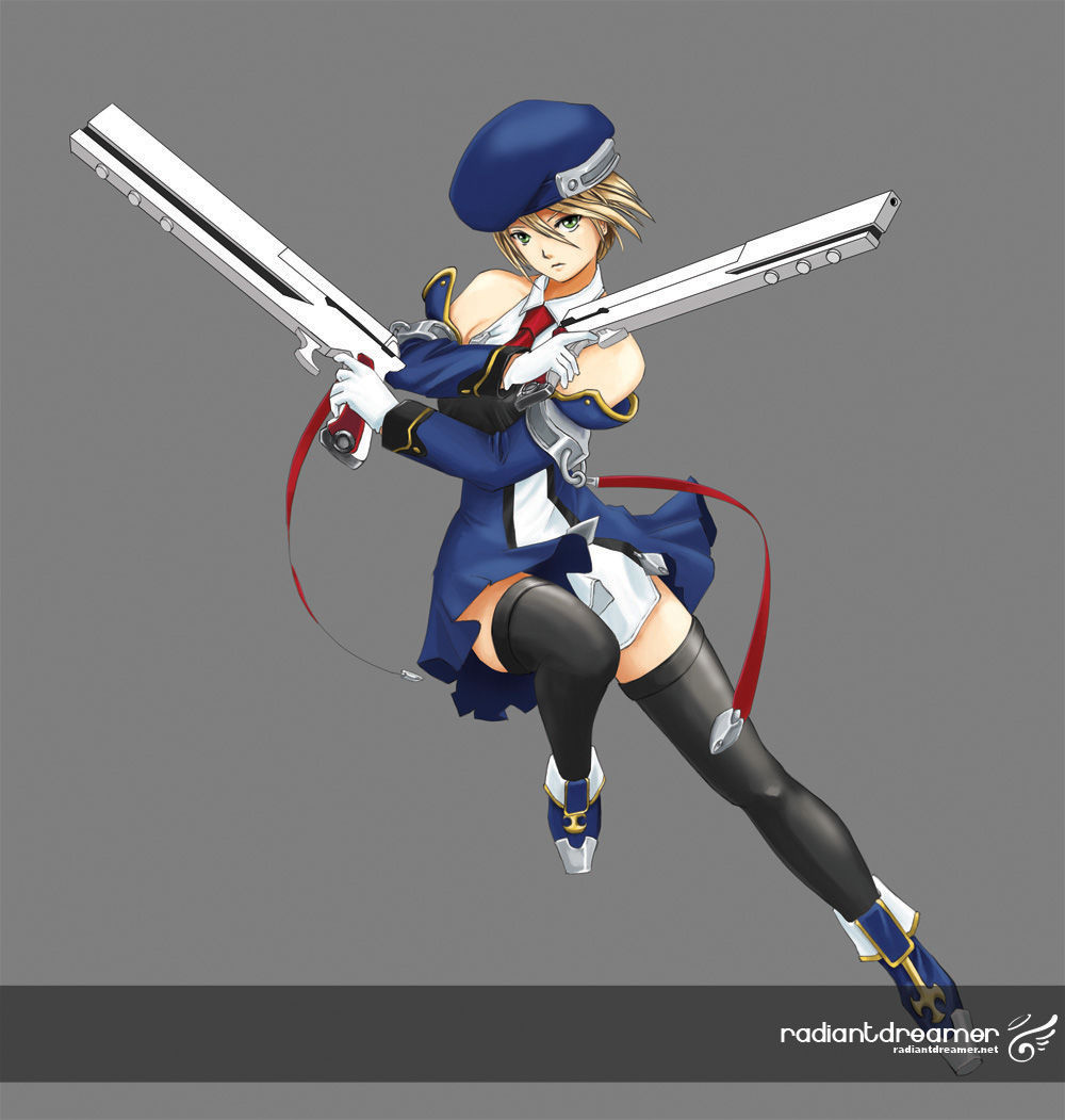
The final image result:
I’m pretty happy with it. I particularly like this section right here:
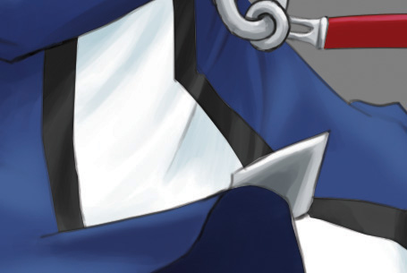
The white part looks particularly accurate to me anyway.
A close up of her face:
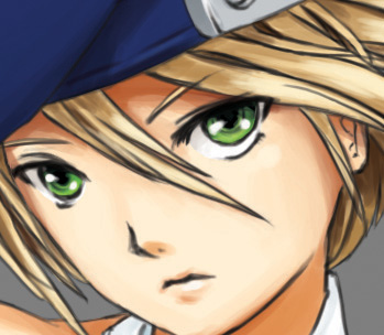
Overall, I’m very happy with the result, and look forward to painting up the next character in the next few days.
If you’re on neogaf, do vote for me when I enter my submission!



Heheh, thats beautiful, love the pose as well
thanks! Stay tuned for the next character I’m gonna paint!
lovely!
Do you have blazblue? let’s try play a match sometime 😀
Sure thing! But be warned – I really really suck. I bring a whole new meaning to the term “button mashing”.
haha i sucked too, i’ve spent total only 3-4 hours on blazblue so far 😀
what time your play time? seems like we can only play at weekends due to different timezone
Really? I thought we’re in the same time-zone. I just haven’t been playing games in general very much at all. Been super busy. But if you’re on msn, then you can add me in (coolartist at hotmail) and meet up for a game or two. I’ve had about the same amount of experience with BB as you. 😛
I play around 9-12pm Australia Eastern time on weekdays, you are in US right? so it should be very early in the morning there at that time.
I’m going to add you to my msn.
I’m in Canada, so pacific time. My mistake too, my msn is coolartist3d.
Still haven’t played BlazBlue yet, but love the art of the game! Love your fan art too!
You’ve definitely improved, and it’s a very clean picture. Though maybe you purposely did it, but the red straps on the official art are quite long compared to the ones you have. I just think long twirly straps make pictures more epic. Love the way you handled the skirt. The black outline for the figure does make the piece a little stiff though, have you considered coloring the line art as well? It usually will add an extra bit of flare to the piece.
I don’t know about the face, as I tend to really like drawing faces, maybe opening her mouth a bit would be cool instead of totally closed like that. Just some general crits, I really love the pic overall though. I can’t wait to see the finished product!
I have an old account on NeoGAF that I never log onto, I’ll log in just to vote! GOOD LUCK! b(><)b
Hey Kin! Thanks for the feedback! I actually have thought of coloring the line art. The official art has colored line art too, while their cover art seems to be black. I’ll try it out and see. And you’re right I did purposefully make the red straps shorter. Though now, I’m thinking about making them twirly and long too. It might work out pretty good and isn’t hard to do. 🙂
An open mouth would add some drama to it, but I’ll have to see how it stacks up against the other characters when I’m done.
Thanks for the support! ^____^
Nice art of Noel.
Thanks! Stay tuned for the next Blazblue art!
Woah, beautiful. Needs a figure rendition now :3
lol I’ll try to bring that up with Arc System Works and see what they say. :3
Nice drawing, good dynamics and shading.
Good job 🙂
Wish I could draw this well.
very nice drawing. the shading is pretty accurate ~
good choice of character to draw too XD
Sugoi art desu!
I wish I can make even the most simplest fanart. orz
Thanks guys!
Samejima, just keep practicing! Your art will improve! 🙂
Wow, I’m really amazed at your artwork… I guess that’s why you’re a graphic artist and I’m just an engineer who appreciates art ^_^ Can’t colour well should be my distinction, but I am able to draft decent outlines.
I’ll be cheering for your box art for sure!
Everyone has their skills. Being an engineer, you get to contribute a lot to the world too. Me, I’m just an artist…
Thanks for the support! 😀
omfg, this is beautiful. Not to be cliche, but this is truly art. Wow, do you mind if I put this is one of my posts? I’ll definitely give credit, just…wowwwwww…
Hey i added you one msn. By the way, i love your art! It’s amazing!! Right now i have problems with proportion and drawing folds and creases for the skirt ><
Can you give me some advice?
Very nice artwork! Great job!
so kawaa
cool =^_^=