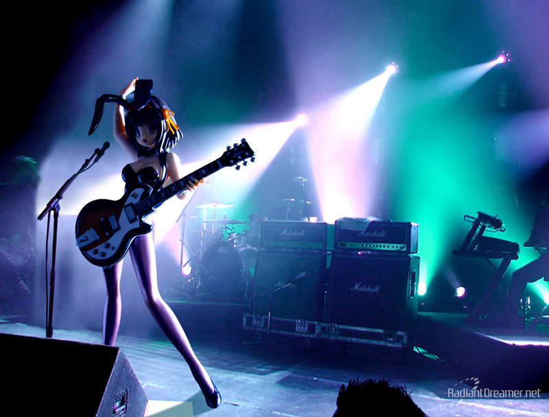
I decided it was time to take a final photoshoot for Haruhi before she disappears from my shelf. A final performance to go out with a bang. So that others may share in her final performance, I’ve documented the process of how this photo was created.
This bunny version of Suzumiya Haruhi will probably be the best quality figure you will ever see coming from Atelier Sai. I had decided to sell her to a friend I had met on Facebook. This figure is actually one of the cute ones that my wife doesn’t mind. Though she thinks there isn’t really anything special about her outfit.
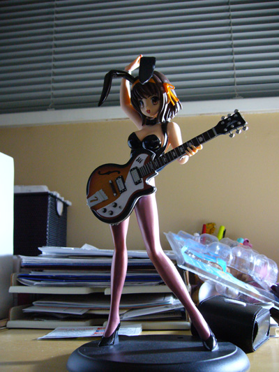
Regardless, I felt it was time to let this one go. I originally bought her with the intent to sell, but became quite attached to this little piece of pvc. I’m guessing the photo that convinced my friend to buy was this one:
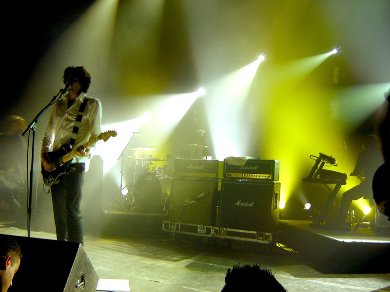
I like this photo. A lot. I took it one sunny day on a whim. It seems that Haruhi is quite photogenic. Of course, the problem with this photo was the terrible background. I suppose that’s what you get on a whim. Not content with letting her go with such a shoddy performance, I decided to give her one last show. This is the original background photo I decided to use:
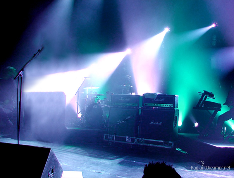
I chose this photo for a challenge. Since it would be Haruhi’s final performance, it’s gotta be a good one! I didn’t really like the color of the background… it was uninteresting and well, green. I also didn’t care much for the singer, just like how that guy in the bottom left corner didn’t care much for him. So I got rid of them:
It’s called photoshop magic! Actually, getting rid of them wasn’t exactly the first thing I did. First, I took a photo of Haruhi under what I was hoping to be the same lighting conditions:

After which, I dropped her into the background image, and did a rough cut, followed by some quick color tweaks to see if it would match and be possible to make this photo. Fortunately, the color tweaks to the original background helped make setting the color tone for Haruhi much easier:
At this point, I began to remove the original singer from the scene, cropped the photo slightly to create a better composition, and painstakingly cut Haruhi out from her original background. You’ll also notice that the microphone is too high for Haruhi to sing with. So I had to cut the microphone out and lower that as well:
The final touches to this photo – add a shadow so that Haruhi didn’t look like she was floating, get rid of the taller microphone, and of course, light Haruhi properly:
But Haruhi’s performance just doesn’t seem smashing enough. I mean, there’s just one guy down there saying “yay.” I’m sure she could do better than that! It’s time to rock the house! Everybody in the house, let me see you get your hands up!
That’s what I’m talkin’ about! Using the polygon lasso tool, I drew in some hands rocking out and providing much needed atmosphere. Color filled with black, and given a gaussian blur to show distance, and a radial blur to show motion. And of course, you gotta finish the light show off with some bloom!
And with that, ends Haruhi’s final performance. I’m satisfied with letting her go to a new owner now. Hope you enjoyed it!
And here’s a reminder treat on how cool the original concert was:
[pro-player]=https://youtube.com/watch?v=WJljjtdMkT0[/pro-player]


great job on the edit, normally japan audiences have the small light tube (phosphor ?) 😀
superb work daniel
oh hey yeah! those ones that you crack and it glows green or something! Yeah, but this is a rock concert. Not some j-pop concert. 😉
Nice work on the photoshop final image! I totally lack that skill in highlighting some of my figures with a nice background… hehe I think Haruhi herself would agree that you did a splendid job for a farewell image for her.
So you finally did let her go eh? Space issues thanks to that God-awful humungous base? :p Well I suppose the guitar does take up quite a bit of space as well ^^
Really sweet work you’ve done there, something I sometimes feel like attempting but words you use such as “painstakingly” make me avoid it, heh. I guess I’m just not cut out for stuff where concentration is required :/ Though truly, it’s not such an exaggeration when you term it “photoshop magic!” 😉
@ shino : heh, yeah. I don’t really mind the base as much as how much clutter my figurines are causing. Everything is so crammed. I need to space them out, have less figures, and to make room for more. 😛 It’s a vicious cycle.
“painstakingly” isn’t really that bad. It’s just tedium is all. It’s the easiest part of the project and the least fun. The fun happens when you start integrating the elements together, the “magic” of it. Not much different than the way you set up your scenes!
Honestly, this shoot took me less than 2 hours to put together, including taking the raw photos. I think I spent more time writing up the blog entry and preparing the process images.
Excellent work for the Goddess !
Heh, I’m sure as well you know I’m rather fond of my excesses, so going by the time frame you’ve laid out which is under two hours, and my penchant for shooting various quirky angles that nobody really wants to look at, we’re looking at 8-10 hrs on scenes alone? :p You know me well enough, not gonna happen, heh.
I think as well with photoshopping, some vision is involved and thats a trait I unfortunately lack. To have to picture in my head of what I want, then finding a background to suit that, I highly doubt I have the tenacity to do that. I wouldn’t have in mind the little stuff like where the lighting is from and try to match it either, details always tend to escape me, it’s visibly evident in almost every shoot I make ^^;
I might be branded “lazy”, “unwilling to learn”, and stuff like that, but I think one point to consider would be that I’m currently content with what is doable for now and so no plans of expanding the repertoire just yet. I’m much happier just watching the experts do it =)
This is probably my favorite photoshop pic out of them all. The background is a really good match with the figure and adds so much atmosphere.
This is really awesome, a fitting parting tribute to a Haruhi figure. I have NO sense of lighting whatsoever so attempting to transplant an object naturally into another background is utterly beyond me – I tip my hat off to you for the painstaking patience in recreating the singing scene!
Quite awesome. Until recently I’ve not had much desire to do anything more than an Auto Contrast adjustment in Photoshop. I’ve started to venture into processing the images a little. The under two-hours part really has me astounded.
@ shino : Perhaps you’re right – coming up with a photoshop image like that may require some vision… but shino, you used to have that vision. Your older works were very creative. I always and will always raise the example of that one photo with the girl busting through the brick wall. That is true pwnage. The idea you had for Claire, also amazing. You do have it in you. Everyone has it in them to dream up something. It just takes persistence to create it. Thanks for the complement. 🙂
@ kin : Thanks! I really appreciate you commenting. I’m glad you like this photoshop photo so much! I hope that the ones I make in the future will be just as good!
@ byaku-chan : Thanks! It’s all in a little practice. When you do it enough, you start to develop a sense on lighting accuracy. A lot of us who post figure photos are direct proof of that – if you look at some of their older works, it’s not nearly as good as their newer works. It’s a natural progression. So if you want to get into it, all you have to do is just start, and you’ll eventually get there.
@ Super Rats: It’s been a long time indeed! I still remember when you corresponded with me and gave me tips on how to photoshop my photos better. I was less than willing to put in as much effort as you did, and wanted something more “automatic”. It looks like you’ve become quite the master at photography if all you have to do nowadays is just click “auto contrast”!! I really love your work. 🙂
I have taken to using 1 or 2 duplicate layers lately, changing its blending mode, adjust the opacity, flatten, and then re-adjust the mid level. If I had the full version of Photoshop I’d just make most of it a one-click process.
And as far as your comment to byaku-chan, I agree. I’ve been going through some of my old shots and it’s only laziness that’s preventing me from reshooting some of them and replacing the photos without saying anything. ^^;
awesome pic yo!
Woow! nice tutorial. Figure + photoshop = nice effect