 Welcome to the second part of my basic compositing tutorial. If you haven’t gone through the first tutorial yet, I suggest you do so. Otherwise you will have no idea where I’m coming from or what I am doing at this halfway point.
The purpose of this tutorial is to teach how you can use the various tools in Photoshop to bring more life to your composited image. We’ll go through things like setting mood, changing shadows and lighting, and the principles of depth using light and general photoshop filters.
As a recap of the previous tutorial, we’ve gone through the process of selecting a background that would fit our subject, (in this case, Miko is our subject) and cut out her shape using the various lasso techniques in the previous tutorial. We also did some minor adjustments using a few of Photoshop’s adjustment menus. After we were finished, we had a fairly nice and convincing composite. But it still looked a little flat and uninteresting. Let’s add a little drama.
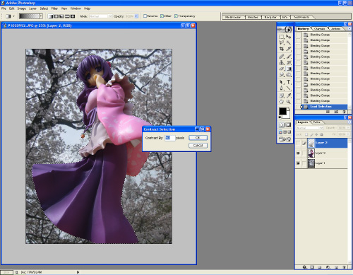 From this particular angle, there is too much light casting on all of Miko, making her flat like cardboard in comparison to the background she is on. You’ll notice that her background does have a darker tone near the bottom. So let’s mimic the same by adding a bit of shadow to her. Ctrl+LMB her layer to select her. Because we had already cut her out in the previous tutorial, the selection should end up an exact shape. Contract the selection slightly (a few pixels worth) under Select-> Modify -> Contract, and feather the selection a few pixels worth under Select -> Feather. This will soften the shadow so that it doesn’t look like an extreme cut-out.
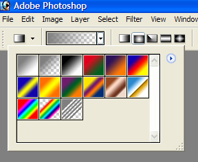 Using the gradient tool, set some parameters. The tool is in the toolbar that shows either a paint bucket or a gradient rectangle. Click and hold the button to bring up the dialog. We need the rectangular gradient tool. You should see a long gradient colored bar on the top left of your screen. (depending on which version of photoshop you are using) click the little arrow beside it to bring up a dialog box similar to the image shown. What we need is the one shown in the second square. This is the gradient to transparent. We also need to set the type of gradient it is. To the right of the gradient bar, you’ll see a bunch of icons in the following order – Ramp, Circular Ramp, Point Ramp, Mirror Ramp, 4 Point Ramp. Each type of gradient has its own purpose, but we will be using the Ramp. Make sure the color you are using is black. The color box on the bottom of your tool bar shows what color you are using. If it isn’t black, click on it to change the color.
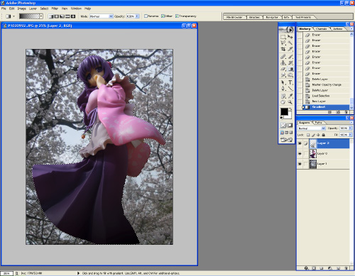 Start up a new layer by clicking on the little paper icon at the bottom of your layers window. Make sure this layer is on top of Miko and is the active layer.
With your selection still active, drag a line from the bottom of Miko to her waist. This should create a rather unappealing dark shadow that goes from black to transparent. Ctrl+D to deselect. Play around with the transparency of this layer until the shadow looks more subtle.
Advanced technique: To create a more realistic shadow, instead of using just black, at this point, duplicate the Miko layer, and set her alpha blending to multiply. Then Ctrl click your shadow layer to use as a mask. Invert the selection on the multiply Miko and hit delete. Hide your shadow layer, and tweak the transparency and color values of the multiply Miko to suit.
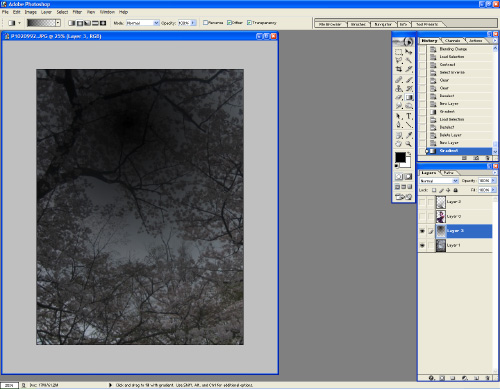 The background itself is too sharp, and is grabbing too much attention. It also flattens the image too much. Let’s give it some depth. As the same with giving Miko some depth using light and shadow, you can also achieve depth through loss of detail. Things closer to the camera have more detail than things in the distance. Since we don’t want to ruin the amount of light shown in the image (and we’re not in a dark cavern or anything) we should blur out the background. But a general blur will not be sufficient because we also want to illustrate height. We can selectively blur what we want by using a selection mask. A mask is like a stencil you put over top of something before you spray paint so that certain elements will be covered by paint while other sections will not. The thing with photoshop masks is that transparency can also be incorporated into it, such as gradients!
At this time, hide everything except your background layer. Start up a new layer on top of it. Use the gradient tool, but this time use the Circular Ramp function. Drag a line from the vanishing point of the background, outwards. The color of this ramp doesn’t matter, as we’re using it as a mask. A vanishing point is a perspective point where objects “appear” to converge to a single point.
 Now that you have a mask, hide it (the little eye icon beside the layer) and make your background layer the active layer (if you fear destroying your background image, I strongly advise duplicating the background layer and using that instead). Ctrl+LMB your mask layer to make a selection. From here, go to Filter -> Blur -> Gaussian Blur (or if you have CS2, Lens Blur looks better). Play around with the blur filter, and you’ll notice that only a portion of your background is blurry, thanks to the mask. Make sure that your blur is subtle, but not so much that it makes Miko pop too much from the background.
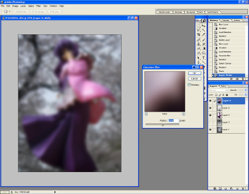 You’re done! But let’s take it a step further. One thing I usually like to do is increase the contrast and add a lens blur to it to make it look all dreamy. This is a VERY easy thing to do with dramatic results. It takes a lot of playing around with and you can very easily overdo it if not done right. The basic gist of it is to duplicate your image, blur it, and change the alpha blend mode to match the mood you are going for. To duplicate your image, select a visible active layer, and Ctrl+A to select the entire image. Ctrl+Shift+C will copy a flattened version of your image to the clipboard. Ctrl+D to deselect your image, and Ctrl+V to paste your composite on a new layer. Move that layer to the top. Visually, you won’t notice anything different. Now, go to Filter -> Blur -> Gaussian Blur, and blur it so that it’s barely recognizable. Change the alpha blend type in the layer window. The default setting is normal. Usually Overlay looks good. Overlay makes your bright colors brighter, and your dark colors darker.
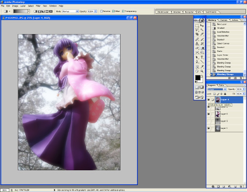 Now you’re really done! This photoshop filtering is just the beginning! You can introduce all sorts of mood lighting and stylistic effects by using filters and masks properly. Use masks to put highlights on things, or selectively apply filters to spots. Play around with various types of filters and blend modes to achieve whatever comes to mind. The thing to keep in mind is don’t overdo it and keep it natural and subtle. Otherwise you just end up with an amaturish mess with oversaturated, over contrasted, and over filtered images!


nice tutorial 😀 I always interested in something like this